This content was presented to Nelson\Nygaard Staff at a Lunch and Learn webinar on Thursday, November 11th, 2021, and is available as a recording here and embedded below.
Introduction
This webinar was developed by request to help staff at Nelson\Nygaard understand how typical Excel tasks may be duplicated in R. Ideas for particular tasks were crowdsourced from the #r-users Slack channel. If there are other tasks like this, please list them for Bryan and he can develop another webinar like this one, with these further tasks, at a later date.
Some of the topics discussed today have already been discussed in previous webinars – I will try to link related webinars where relevant. Other topics (e.g., writing to Excel and reading/writing from/to Google Sheets) have not been covered in a previous webinar. Nevertheless, even for topics that have already been covered, the goal is to emphasize how these topics are similar to procedures often carried out in Excel.
Sample Data
I’m going to be using a sample of survey data from the Slabtown Travel Choice Survey – the same sample data I used in the Survey Analysis webinar. This survey is conducted annually for the Slabtown neighborhood in NW Portland (Oregon) as part of a Transportation Management Association (TMA) program. Feel free to download the data sample yourself as part of this repository (TO LINK) to test out the demonstrations herein yourself.
Agenda
Summarizing functions (~10 minutes)
Joins and lookups (~10 minutes)
Tidy Data & Reshaping data (~10 minutes)
Simple plot creation (~10 minutes)
Communicating between Excel and R (~10 minutes)
Google Sheets and R (~10 minutes)
1) Summarizing Functions
Motivation
For this section and the following section, we are going to refer to pieces of RStudio’s Data Transformation Cheat Sheet to provide both visualization and demonstration of basic syntax for data transformation.
In Excel, when confronted with survey data, there are two typical ways that analysts summarize that data to, for example, understand the proportion of survey respondents that selected a particular response to a survey question. The two methods are:
Using Pivot Tables, an interactive tool for grouping and summarizing spreadsheet data.
Setting up your own summary table with the unique groups you are interested in (perhaps using Excel’s Remove Duplicates procedure), and then using
COUNTIFS(),SUMIFS(), and other summary functions to obtain summaries for the groups identified.
When I use Excel, I prefer to do the latter, as Pivot Tables must be operated entirely interactively, whereas the second method allows for some level of automation and reproducibility. Nevertheless, Pivot Tables are a user-friendly and popular method for summarizing data.
R enables you to carry out the process of grouping and summarizing in a succinct and reproducible syntax. The below two images from the Data Transformation Cheat Sheet demonstrate the basic syntax of grouping and summarizing, as well as a number of typical summary functions.


Example
library(tidyverse)
library(readxl)
library(janitor)

raw_data = read_excel("examples/1-summarizing/1-summarizing.xlsx",sheet="raw") %>%
  clean_names()

num_respondents = n_distinct(raw_data$respondent_id)

summary = raw_data %>%
  group_by(do_you_currently_live_or_work_in_slabtown) %>%
  summarise(count = n()) %>%
  mutate(prop_respondents = count/num_respondents)

summary
# A tibble: 6 x 3
  do_you_currently_live_or_work_in_slabtown     count prop_respondents
  <chr>                                         <int>            <dbl>
1 Both live and work full-time                     24           0.0464
2 Both live and work part-time                      7           0.0135
3 Live                                             80           0.155
4 No, but I visit the area and/or Slabtown bus~   212           0.410
5 Work full-time                                  166           0.321
6 Work part-time                                   28           0.0542
2) Joins and Lookups
Motivation
Most data we work contain fields that identify relationships to other data – e.g., a stop identifier in a set of boarding observations. This is called relational data. You may be familiar with the concepts of joins or lookups or both – they are trying to solve the same problem. In Excel, VLOOKUP() is a critical function to pull in data from other tables (as well as it’s less commonly used counterpart HLOOKUP()). VLOOKUP takes a particular lookup value, a reference table, and column to pull, to pull in data from one table to another. This functionality can be replaced by a join – a relational data term for combining two datasets based on matches between specified fields. Joins are ultimately a more flexible way to solve the problem of combining relational data – we will demonstrate how to solve the same problem in Excel and R.
Visuals and syntax from the Data Transformation Cheat Sheet are provided below for reference.

Example
raw_data = read_excel("examples/2-joins-lookups/2-joins-lookups.xlsx",sheet="raw") %>%
  clean_names()

respondent_types = read_excel("examples/2-joins-lookups/2-joins-lookups.xlsx",sheet="respondent_types") %>%
  clean_names()

joined_data = raw_data %>%
  left_join(respondent_types,by="do_you_currently_live_or_work_in_slabtown")

joined_data
# A tibble: 517 x 6
   respondent_id do_you_currently_live_or_wo~ respondent_type employee
           <dbl> <chr>                        <chr>           <lgl>
 1   12168188478 Work full-time               Employee        TRUE
 2   12160704110 Work full-time               Employee        TRUE
 3   12160356598 Work full-time               Employee        TRUE
 4   12160202354 Work full-time               Employee        TRUE
 5   12159994087 Work full-time               Employee        TRUE
 6   12159992983 Work part-time               Employee        TRUE
 7   12159991809 Work full-time               Employee        TRUE
 8   12159991644 Work full-time               Employee        TRUE
 9   12159991138 Work full-time               Employee        TRUE
10   12159990551 Work full-time               Employee        TRUE
# ... with 507 more rows, and 2 more variables:
#   full_time_employee <lgl>, resident <lgl>
total_num_respondents = n_distinct(raw_data$respondent_id)
respondent_type_summary = joined_data %>%
group_by(respondent_type) %>%
summarise(num_respondents = n()) %>%
mutate(prop_respondents = num_respondents/total_num_respondents) %>%
arrange(desc(prop_respondents))
respondent_type_summary
# A tibble: 4 x 3
  respondent_type     num_respondents prop_respondents
  <chr>                         <int>            <dbl>
1 Visitor                         212           0.410
2 Employee                        194           0.375
3 Resident                         80           0.155
4 Resident & Employee              31           0.0600
3) Tidy Data & Reshaping Data
Motivation
For this section, we are going to refer to pieces of RStudio’s Data Tidying Cheat Sheet to provide both visualization and demonstration of basic syntax for data tidying/reshaping. Sometimes, when working with spreadsheet data, you receive data in what we will refer to as a non-tidy format – variable observation information is stored in columns and rows. Tidy data must have all variables as columns and observations as rows – we will go through an example of reshaping from one to the other. For more on the Tidyverse, please refer to the Intro to the Tidyverse Webinar


Example
raw_data = read_excel("examples/3-tidy-reshape/3-tidy-reshape.xlsx",sheet="raw",
                      skip = 1) %>%
  clean_names() %>%
  rename(respondent_id = x1)

reshaped_data = raw_data %>%
  pivot_longer(cols = monday_travel_mode:sunday_travel_mode)

cleaned_data = reshaped_data %>%
  separate(name,sep = "_", into = c("weekday","temp_1","temp_2")) %>%
  select(-temp_1,-temp_2) %>%
  mutate(weekday = str_to_title(weekday)) %>%
  rename(mode = value) %>%
  filter(!is.na(mode))

cleaned_data
# A tibble: 1,732 x 3
   respondent_id weekday   mode
           <dbl> <chr>     <chr>
 1   12168188478 Monday    BICYCLED; Includes electric-assist bicycle~
 2   12168188478 Tuesday   TOOK TRANSIT; Includes bus, train, streetc~
 3   12168188478 Wednesday BICYCLED; Includes electric-assist bicycle~
 4   12168188478 Thursday  TOOK TRANSIT; Includes bus, train, streetc~
 5   12168188478 Friday    BICYCLED; Includes electric-assist bicycle~
 6   12168188478 Saturday  DID NOT WORK DUE TO OTHER REASON; Includes~
 7   12168188478 Sunday    DID NOT WORK DUE TO OTHER REASON; Includes~
 8   12160704110 Monday    DROVE ALONE; Includes carsharing and ride-~
 9   12160704110 Tuesday   WORKED FROM HOME; Working offsite during n~
10   12160704110 Wednesday DROVE ALONE; Includes carsharing and ride-~
# ... with 1,722 more rows
#clipr::write_clip(cleaned_data)
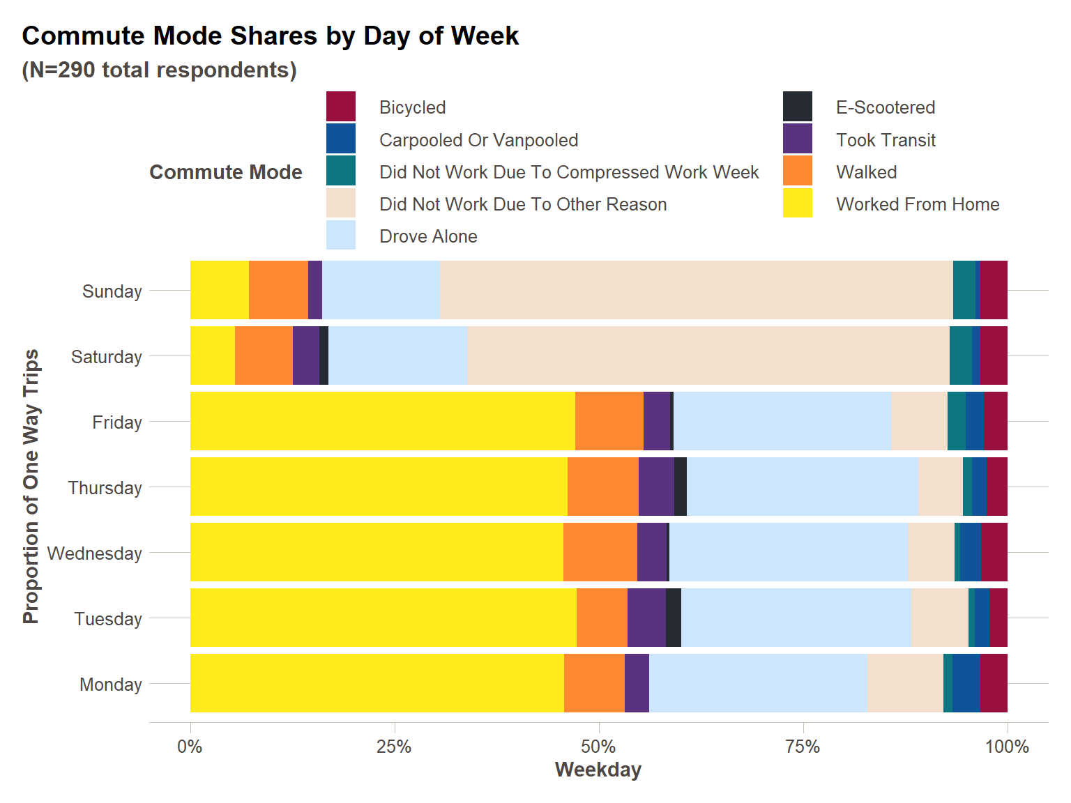
4) Simple Plot Creation
Motivation
Creating plots in R can be more complex than it is in Excel, but for a little more time you can derive benefits both in terms of customization and reproducibility. RStudio has an excellent cheat sheet for plot production using ggplot2 you should refer to often when creating plots. We will go through a simple example in both R and Excel to show the differences. For more on plotting, please refer to the EDA/plotting webinar.
Example
library(scales)
library(ftplottools)

summary_clean_data = cleaned_data %>%
  mutate(mode_short = map_chr(mode,~(str_split(.x,"; ") %>% unlist() %>%
                                       str_to_title())[1])) %>%
  group_by(weekday,mode_short) %>%
  summarise(num_one_way_trips = n()) %>%
  mutate(prop_one_way_trips = num_one_way_trips/sum(num_one_way_trips)) %>%
  ungroup() %>%
  mutate(weekday = factor(weekday,ordered = TRUE,
                          levels = c("Monday","Tuesday","Wednesday",
                                     "Thursday","Friday","Saturday","Sunday")))

num_respondents = n_distinct(cleaned_data$respondent_id)

plot_colors = (ft_colors() %>% as.character())[4:13]
#show_col(ft_colors())

ggplot(summary_clean_data,aes(x=weekday,y=prop_one_way_trips,fill=mode_short))+
  geom_col() +
  ft_theme() +
  coord_flip()+
  guides(fill = guide_legend(nrow=5, title = "Commute Mode"))+
  #scale_fill_brewer(palette = "Set1")+
  scale_fill_manual(values = plot_colors)+
  scale_y_continuous(labels=percent) +
  labs(
    x = "Proportion of One Way Trips",
    y = "Weekday",
    title = "Commute Mode Shares by Day of Week",
    subtitle = paste0("(N=",num_respondents," total respondents)")
  )
5) Communicating Between Excel and R
Motivation
Regardless of the benefits of R over Excel, sometimes it is necessary to communicate between the two software packages. We showed above how to use read_excel() from the readxl package, and I like using readxl for reading excel sheets because it is integrated into the tidyverse family of packages, but unfortunately it does not have a write function. This is where openxlsxcomes in handy. There are other packages for writing to Excel spreadsheets, but I have found openxlsx` to be the most flexible.
Example
In this case, instead of copying and pasting the cleaned commute mode/trip data directly into Excel, let’s create a new workbook and save it out. You can also add formatting to your Excel worksheets if you like – in this case I like to make my Excel sheets in Arial Narrow font, size 10, with the header row bolded and underlined.
library(openxlsx)

#Initiate workbook object
wb = createWorkbook()

#Add worksheet to workbook in which to store data
addWorksheet(wb,"clean_mode_data")

#Specify styles
header_style <- createStyle(fontName = "Arial Narrow", fontSize = 10, textDecoration = "Bold", border = "bottom",borderStyle = "thick")
cell_style = createStyle(fontName = "Arial Narrow", fontSize = 10)

#Write data to sheet
#Write data, can specify header style in this call
writeData(wb,"clean_mode_data",cleaned_data, headerStyle = header_style)
#Style rest of cells
addStyle(wb,"clean_mode_data",cell_style,rows = 2:(nrow(cleaned_data)+1), cols = 1:ncol(cleaned_data),gridExpand = TRUE)
#Save workbook
saveWorkbook(wb,file = "examples/5-communicating-excel/5-write-example.xlsx", overwrite = TRUE)

# Another option
# xl_out_lst <- list('ENTRADA_Input' = Export_User_Input0, 'ENTRADA_Output' = Export_Output0)
# openxlsx::write.xlsx(xl_out_lst, file = "ENTRADA_Export_Output.xlsx", row.names = FALSE, col.names = FALSE, overwrite = TRUE)
6) Google Sheets and R
Motivation
Google sheets is also a great option for back and forth communication between R and a spreadsheet. Google sheets are great for collaboration, and don’t have some of the ‘quirks’ of Microsoft that make working with Excel in R a bit clunkier than other data formats. Thanks to the googlesheets4 package, the syntax works well with other functions from the the tidyverse. I use it to maintain an R workload tracker based on folks inputting their workload projections into a Googlesheet. A similar thing could be implemented in Excel, Google Sheets is just a little more lightweight to use. Below is an example of writing out what you did above to a Google sheet.
Example
# library(googlesheets4)
#
# #You need to run these lines interactively to create
# gs4_auth()
#
# gswb = gs4_create(name="nn-training-sheets-example")
#
# gswb %>% write_sheet(cleaned_data,.,sheet = "cleaned_mode_data")
#
# #Will open spreadsheet in your browser
# gswb %>% gs4_browse()
This content was presented to Nelson\Nygaard Staff at a Lunch and Learn webinar on Thursday, November 11th, 2021, and is available as a recording here and embedded at the top of the page.