This content was presented to Nelson\Nygaard Staff at a Lunch and Learn webinar on Thursday, September 2nd 2021, and is available as a recording here and embedded below.
Today’s Agenda
- Introduction (10 min)
- Setting up a data dictionary for automated analysis (10 min)
- Geocoding respondents (5 min)
- Simple multiple choice questions (10 min)
- Compound multiple choice questions (10 min)
- Open ended questions (10 min)
- Further resources (5 min)
Introduction
Many different types of projects across sectors use surveys to elicit information from the general public or a more specific stakeholder group. Some projects will use multiple surveys over time to measure performance on some key metrics within a specific population (e.g., an annual commuter survey) in relation to longer term objectives.
Often, Nelson\Nygaard will develop and distribute the survey instrument using a web tool like SurveyMonkey, Maptionaire, or even a custom purpose-developed tool. Other times, a client may give you access to data from one or more surveys.
Across these different situations there are some common skills that can be used to analyze surveys both within R as well as outside of it. This module will touch briefly on each of a variety of critical skills – some survey analyses may use all of these, while others may use only one or two.
Today we are going to use results of the 2020 commuter survey conducted annually for the Slabtown neighborhood in NW Portland (Oregon) as part of a Transportation Management Association (TMA) program to demonstrate survey analysis techniques.
Some gaps in this module that could be covered in a future one if there is sufficient interest:
- Weighting responses or respondents. Typically, the goal of the survey is to make inferences about a broader population than is actually surveyed. If the entire population of interest is surveyed, this is a special case of survey called a census. Censuses are expensive to conduct – the U.S. population Census conducted every 10 years as required by the U.S. Constitution is the one you have most likely heard of – and so surveys aiming to represent a broader population are common. The American Community Survey (ACS) is a survey data product conducted and supplied for public use by the U.S. Census Bureau to understand more detailed demographic and other characteristics of the American population than are assessed by the simple (10 questions in 2020) U.S. Census. Since May 2020, as part of an effort to understand effects of the COVID-19 pandemic, the U.S. Census bureau has been conducting a more frequent survey (approximately twice a month) – the Household Pulse Survey. I’d like to look at HPS results in a future module. For both the ACS and the HPS, the Census Bureau weights responses based on a few demographic characteristics and corrects for non-response bias to more accurately extrapolate the results obtained in the survey sample to the entire American population, and geographic subareas within it. For the Slabtown survey, we will not be considering weighting, as the project itself did not consider weighting the responses.
Setting up and/or using a data dictionary for automated analysis
You’re going to need to download the files associated with this module to view the Excel files shown in the recording. The files are available as part of the GitHub repository for this site.
In the above recording, I will talk about the assembly of the data dictionary (or schema) from the raw SurveyMonkey results. Note that only a subset of the SurveyMonkey results are included here, both to protect respondent privacy and to simplify this demonstration.
After assembling the data dictionary, we are going to load the resultant tables in to join with the raw survey data. After pivoting the survey data to the long format, and then joining the several dictionary tables, we have a cleaner dataset to analyze for the rest of the demonstration.
library(tidyverse)
library(readxl)
library(googleway)
library(janitor)
library(sf)
library(leaflet)
library(ftplottools)
library(scales)
library(tidytext)
library(wordcloud)

#Need to skip column headers, will attach them via join
raw_slabtown_data = read_excel("data/slabtown-2020-commuter-survey/raw-2020-survey-results-subset.xlsx",skip=2,col_names = FALSE) %>%
  clean_names() %>%
  #Respondent ID column must be called out explicitly to be left out of pivot
  rename(respondent_id = x1)

column_defs = read_excel('data/slabtown-2020-commuter-survey/slabtown-2020-simplified-schema.xlsx', sheet = "column_defs")
questions = read_excel('data/slabtown-2020-commuter-survey/slabtown-2020-simplified-schema.xlsx', sheet = "questions")
answers = read_excel('data/slabtown-2020-commuter-survey/slabtown-2020-simplified-schema.xlsx', sheet = "answers")

clean_slabtown_data = raw_slabtown_data %>%
  pivot_longer(x2:x27,
               names_to = "column_label",
               values_to = "answer_text") %>%
  #Removing empty cells from dataset
  filter(!is.na(answer_text)) %>%
  mutate(column_num = as.numeric(str_replace(column_label,"x",""))) %>%
  left_join(column_defs) %>%
  left_join(questions) %>%
  left_join(answers) %>%
  mutate(open_ended_text = replace_na(open_ended_text,TRUE))
Geocoding respondents
This section repeats skills discussed in the previous Google APIs training.
The first thing you need to do when using the googleway package to geocode text describing geographic locations (in this case, zip codes) is to set your Google API key. More information about how to set up a Google API key is provided in the previous Google APIs training.
#Using an API Key set up for NN R training -- please use your own API key below
set_key('<YOUR API KEY HERE>')
After you have set your API key, you will want to compose a text string to geocode, and then run it through the geocoding function. To reduce the number of queries we are using, we can group respondents by ZIP code and just geocode the ZIP codes. Finally, I created a map to visualize where the survey respondents’ home location ZIP codes are.
slabtown_respondent_zips = clean_slabtown_data %>%
  #Refer to questions table to get correct question_id
  filter(question_id == 5) %>%
  #We're going to use just the ZIP code
  filter(col_subheader == "ZIP/Postal Code") %>%
  select(respondent_id,answer_text) %>%
  rename(zip_code_raw = answer_text)

zip_code_locs = slabtown_respondent_zips %>%
  group_by(zip_code_raw) %>%
  summarise(num_respondents = n_distinct(respondent_id)) %>%
  arrange(desc(num_respondents)) %>%
  mutate(geocode_results = list_along(zip_code_raw))

for(i in 1:nrow(zip_code_locs)){
  z_string = zip_code_locs$zip_code_raw[i]

  res = google_geocode(z_string)

  if(res$status=="OK"){
    address_components = res$results$address_components[[1]] %>%
      unnest(types) %>%
      filter(types != "political") %>%
      select(types,long_name) %>%
      pivot_wider(names_from=types,values_from=long_name)

    loc = res$results$geometry$location

    res_tibble = bind_cols(loc,address_components)

    zip_code_locs$geocode_results[[i]] = res_tibble
  }

}

zip_code_loc_geom = zip_code_locs %>%
  unnest(geocode_results) %>%
  #Looks like there is one bad ZIP code that got geocoded to Germany -- this could be manually corrected in responses if possible
  filter(administrative_area_level_1 %in% c("Oregon","Washington")) %>%
  st_as_sf(coords = c("lng","lat"), crs=4326)

slabtown_geocode_res = google_geocode("Slabtown Portland, OR")
slabtown_marker_geom = slabtown_geocode_res$results$geometry$location %>%
  st_as_sf(coords = c("lng","lat"), crs=4326)

leaflet() %>%
  addProviderTiles("CartoDB.Positron") %>%
  addCircles(data = zip_code_loc_geom, radius =~ num_respondents*10,
                   weight= 0.25, color='white', fillOpacity = 0.5, opacity=1,
             fillColor = "blue",
                   highlightOptions = highlightOptions(weight=1.5, fillOpacity = 0.8),
             label=~paste0(postal_code,": ",
                           scales::comma(num_respondents,accuracy = 1)," respondents")) %>%
  addMarkers(data=slabtown_marker_geom, label='Slabtown')
Simple multiple choice questions
When analyzing surveys, I differentiate between simple and compound multiple choice questions.
Compound multiple choice questions actually have multiple questions being asked – in this example, the question asking about what commute mode is used each day of the week is actually seven sub-questions. These are analyzed differently, as we still want to analyze the sub-questions as part of one research question, rather than individually per day of week. These will be analyzed in the following section.
Simple multiple choice questions are just a single question. They do, however, come in two broad categories – 1) single selection and 2) multiple selection (you can pick multiple options). Multiple selection (but still simple multiple choice) questions are also analyzed slightly differently, as each respondent can respond more than once. We’ll proceed through a single selection question and a multiple selection question below.
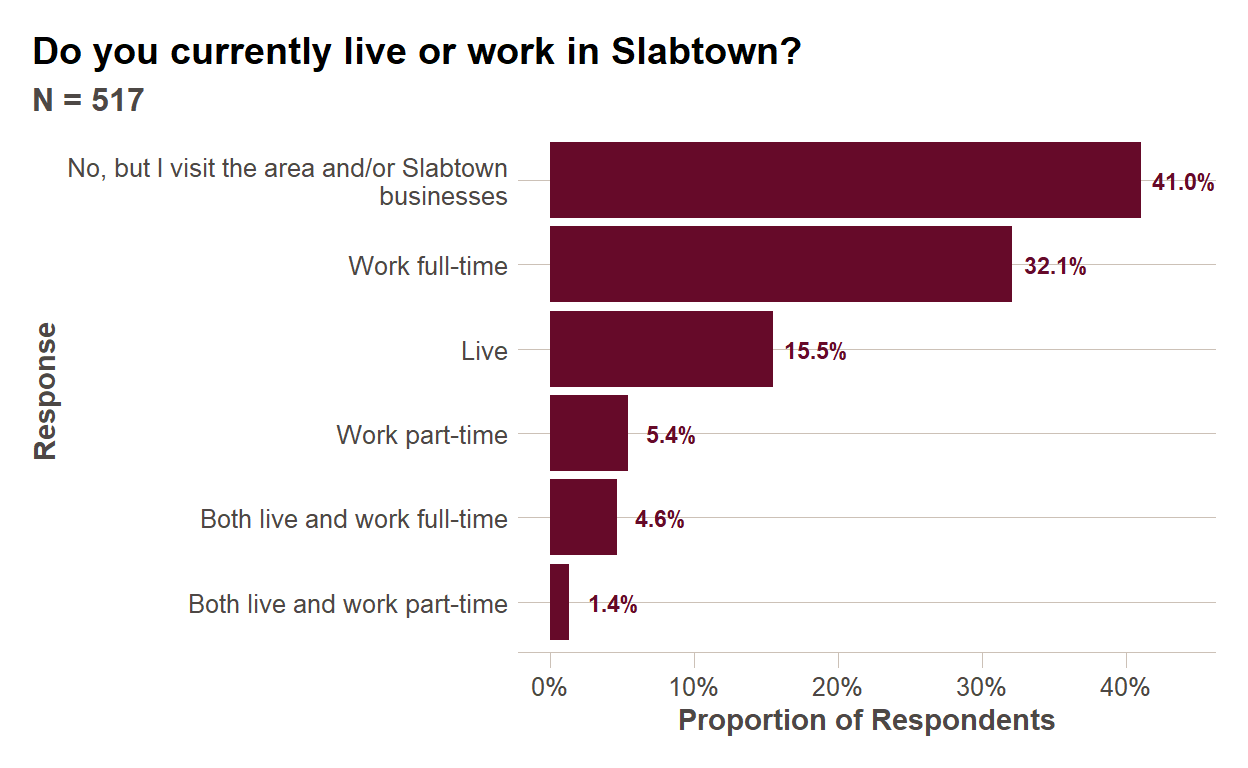
Single Selection
Single selection simple multiple choice questions are the easiest to analyze. You are typically seeking to understand the proportions among the respondent pool who selected each response. I will typically order the responses in descending order of frequency unless the responses have an inherent order (which I call ordinal when I put together the data dictionary). There are some other plot formatting techniques used below I will discuss in the recording, and you can also refer back to the EDA/plotting module.
summ_responses = clean_slabtown_data %>%
  filter(question_id == 1)  %>%
  group_by(simp_answer_text) %>%
  summarise(num_respondents = n_distinct(respondent_id)) %>%
  mutate(prop_respondents = num_respondents/sum(num_respondents)) %>%
  arrange(prop_respondents) %>%
  #Wrap text for long responses to better compose plot area
  mutate(simp_answer_text = str_wrap(simp_answer_text,40)) %>%
  #Set up factor so that responses appear in descending order of frequency
  mutate(simp_answer_text = factor(simp_answer_text,ordered=TRUE,levels = simp_answer_text))

num_respondents = sum(summ_responses$num_respondents)

ggplot(summ_responses,aes(x=simp_answer_text,
                          y=prop_respondents))+
  geom_col(fill = ft_colors('claret-40')) + coord_flip()+
  ftplottools::ft_theme()+
  scale_y_continuous(labels=function(x){percent(x,accuracy=1)},
                     name="Proportion of Respondents")+
  geom_text(aes(label = percent(prop_respondents,accuracy = 0.1)),
            nudge_y = 0.03, size=3,
            color = ft_colors('claret-40'),
            fontface="bold")+
  labs(x="Response",
       title = questions$question_text[questions$question_id==1],
       subtitle = paste0("N = ",num_respondents))
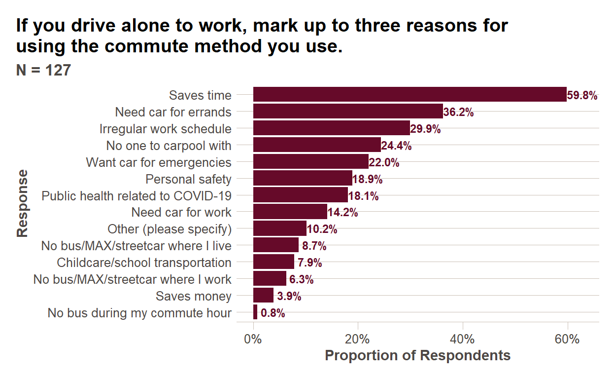
Multiple Selection
Multiple selection questions can be analyzed similarly, with one slight difference. You are also interested in understanding the proportion of respondents who selected a particular response, but each respondent can select more than one response. So instead of dividing by the total number of responses to calculate a proportion, you will want to divide by the number of unique respondents.
sub_responses = clean_slabtown_data %>%
  filter(question_id == 3)

num_respondents = n_distinct(sub_responses$respondent_id)

summ_responses = sub_responses  %>%
  # We will look at open ended text for this question later in module
  mutate(simp_answer_text = ifelse(is.na(simp_answer_text),col_subheader,simp_answer_text)) %>%
  group_by(simp_answer_text) %>%
  summarise(num_responses = n_distinct(respondent_id)) %>%
  mutate(prop_respondents = num_responses/num_respondents) %>%
  arrange(prop_respondents) %>%
  #Wrap text for long responses to better compose plot area
  mutate(simp_answer_text = str_wrap(simp_answer_text,40)) %>%
  #Set up factor so that responses appear in descending order of frequency
  mutate(simp_answer_text = factor(simp_answer_text,ordered=TRUE,levels = simp_answer_text))

ggplot(summ_responses,aes(x=simp_answer_text,
                          y=prop_respondents))+
  geom_col(fill = ft_colors('claret-40')) + coord_flip()+
  ftplottools::ft_theme()+
  scale_y_continuous(labels=function(x){percent(x,accuracy=1)},
                     name="Proportion of Respondents")+
  geom_text(aes(label = percent(prop_respondents,accuracy = 0.1)),
            nudge_y = 0.03, size=3,
            color = ft_colors('claret-40'),
            fontface="bold")+
  labs(x="Response",
       title = str_wrap(questions$question_text[questions$question_id==3],60),
       subtitle = paste0("N = ",num_respondents))
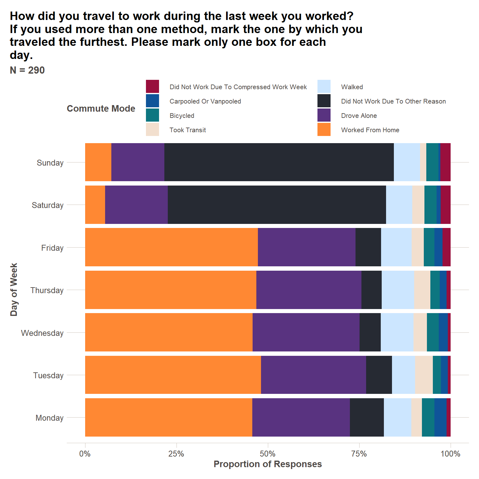
Compound multiple choice questions
With compound questions, we might be interested to understand both the proportion of respondents who selected each response and the proportion of particular responses within a sub-question. I will demonstrate both plots below.
sub_responses = clean_slabtown_data %>%
  filter(question_id == 2)

num_respondents = n_distinct(sub_responses$respondent_id)

summ_responses = sub_responses %>%
  select(respondent_id,col_subheader,simp_answer_text) %>%
  filter(!is.na(simp_answer_text)) %>%
  mutate(day_of_week = str_replace(col_subheader," - Travel Mode","")) %>%
  group_by(day_of_week,simp_answer_text) %>%
  summarise(num_responses = n()) %>%
  #Calculating both
  mutate(prop_responses = num_responses/sum(num_responses),
         prop_respondents = num_responses/num_respondents) %>%
  ungroup() %>%
  mutate(day_of_week = factor(day_of_week,ordered=TRUE,
                              levels = c("Monday","Tuesday","Wednesday","Thursday","Friday","Saturday","Sunday"))) %>%
  group_by(simp_answer_text) %>%
  mutate(mode_total = sum(num_responses)) %>%
  ungroup() %>%
  arrange(mode_total) %>%
  mutate(simp_answer_text = factor(simp_answer_text, ordered=TRUE,
                                   levels = unique(simp_answer_text)))

ggplot(summ_responses, aes(x=day_of_week, y=prop_respondents, fill=simp_answer_text))+
  geom_col()+
  coord_flip()+
  ftplottools::ft_theme()+
  scale_fill_manual(values = as.character(ft_colors()[4:12]))+
  scale_y_continuous(labels=function(x){percent(x,accuracy=1)},
                     name="Proportion of Respondents")+
  guides(fill = guide_legend(title = "Commute Mode", nrow = 4))+
  theme(legend.text = element_text(size=8))+
  labs(x="Day of Week",
       title = str_wrap(questions$question_text[questions$question_id==2],60),
       subtitle = paste0("N = ",num_respondents))

ggplot(summ_responses, aes(x=day_of_week, y=prop_responses, fill=simp_answer_text))+
  geom_col()+
  coord_flip()+
  ftplottools::ft_theme()+
  scale_fill_manual(values = as.character(ft_colors()[4:12]))+
  scale_y_continuous(labels=function(x){percent(x,accuracy=1)},
                     name="Proportion of Responses")+
  guides(fill = guide_legend(title = "Commute Mode", nrow = 4))+
  theme(legend.text = element_text(size=8))+
  labs(x="Day of Week",
       title = str_wrap(questions$question_text[questions$question_id==2],60),
       subtitle = paste0("N = ",num_respondents))
Open ended questions
Open ended questions are the most laborious to analyze in any survey. As a general survey design principle, they should be minimized to the greatest extent possible. And yet, they can sometimes be useful for understanding respondent preferences you might not have thought of prior to designing the survey. Below are some approaches for making use of open ended question responses.
Reasons for Driving
Two most common strategies – 1) word frequency analysis and 2) category binning. Other more complex strategies include sentiment analysis, topic modeling, and others discussed in detail in the book Text Mining with R: A Tidy Approach. Frequency analysis makes sense to do in R, topic binning is a better Excel task because of its mostly manual nature.
open_ended = clean_slabtown_data %>%
  filter(question_id == 3, open_ended_text==TRUE)  %>%
  select(respondent_id,answer_text) %>%
  #split out sentences into words
  unnest_tokens(word,answer_text) %>%
  #Remove stop words
  anti_join(stop_words)

common_words = open_ended %>%
  group_by(word) %>%
  summarise(num_respondents = n_distinct(respondent_id)) %>%
  arrange(desc(num_respondents))

head(common_words,n=10)
# A tibble: 10 x 2
   word     num_respondents
   <chr>              <int>
 1 car                    2
 2 commute                2
 3 distance               2
 4 20                     1
 5 30                     1
 6 becuase                1
 7 bus                    1
 8 camas                  1
 9 changed                1
10 covid                  1
Employer
Similarly, we can see common employers by doing a word frequency analysis below. We will again probably want to bin these response into categories.
open_ended = clean_slabtown_data %>%
  filter(question_id == 4, open_ended_text==TRUE)  %>%
  select(respondent_id,answer_text) %>%
  #split out sentences into words
  unnest_tokens(word,answer_text) %>%
  #Remove stop words
  anti_join(stop_words)

common_words = open_ended %>%
  group_by(word) %>%
  summarise(num_respondents = n_distinct(respondent_id)) %>%
  arrange(desc(num_respondents))

head(common_words,n=20)
# A tibble: 20 x 2
   word       num_respondents
   <chr>                <int>
 1 xpo                     84
 2 logistics               64
 3 meketa                  19
 4 zapproved               19
 5 investment              15
 6 prometheus               7
 7 bird                     5
 8 estate                   5
 9 feet                     5
10 fleet                    5
11 mama                     5
12 pdx                      5
13 real                     5
14 breakside                4
15 pistils                  4
16 cream                    3
17 employed                 3
18 fifty                    3
19 ice                      3
20 licks                    3
Further resources
Books
- Text Mining with R: A Tidy Approach by Julia Silge and David Robinson
- Analyzing US Census Data: Methods, Maps, and Models in R by Kyle Walker
DataCamp Courses
This content was presented to Nelson\Nygaard Staff at a Lunch and Learn webinar on Thursday, September 2nd 2021, and is available as a recording here and embedded above.