This content was presented to Nelson\Nygaard Staff at a GIS Hangout on Wednesday, May 26th, 2021, and is available as a recording here and embedded below.
Today’s Agenda
- Reading in source data for tutorial and exploration (2-3 min)
- Basic Mechanics of
ggplot2()(15-20 minutes) - Exploratory Data Analysis using
ggplot2()(remainder)
Reading in the Data
Vaccine Hestiancy (by County, per April 15th, 2021 model from CDC)
You could get this data using an API but to make it easiest to reproduce we are going to download as a CSV to our project directory from this link on the CDC website.
library(tidyverse)
library(tigris)
library(sf)
library(httr)
library(janitor)
library(scales)
library(knitr)
library(kableExtra)
library(broom)
library(sjPlot)
#installed one GitHub only package (for now) from Urban Institute for map plotting with ggplot
#devtools::install_github("UrbanInstitute/urbnmapr")
library(urbnmapr)
#Installed another GitHub only package from FT for FT plot theme
#remotes::install_github("Financial-Times/ftplottools")
library(ftplottools)

county_vax_hes = read_csv('data/Vaccine_Hesitancy_for_COVID-19__County_and_local_estimates_v2.csv') %>%
  clean_names()

#Get county TIGER files from TIGRIS
counties = counties()
#Get counties file that is easier to compose in map for ggplot
counties_map <- get_urbn_map("counties", sf = TRUE)
Vaccination & Cases Time Series Data (by County)
Register for an API key here.
#Read in your inidividual API Key here
covid_api_key = readLines('data/COVID-api-key.txt')

#Historic time series
query_url = paste0('https://api.covidactnow.org/v2/counties.timeseries.csv?apiKey=',covid_api_key)
county_ts = read_csv(query_url) %>% clean_names()

#Grab current data as a quick way of getting county level populations
query_url = paste0('https://api.covidactnow.org/v2/counties.csv?apiKey=',covid_api_key)
county_pops = read_csv(query_url) %>% clean_names() %>%
  select(fips,population)

#Subset time series data for just most recent date for each county
recent_county_ts = county_ts  %>%
  filter(!is.na(actuals_vaccinations_completed),
         !is.na(actuals_vaccinations_initiated)) %>%
  group_by(fips) %>%
  #Filter down to most recent date for each county
  filter(date == max(date)) %>%
  ungroup() %>%
  #select interesting subset of columns
  select(fips, actuals_vaccinations_completed, actuals_vaccinations_initiated) %>%
  rename(fips_code = fips) %>%
  #Join to county level population estimates to estimate vaccination rate
  left_join(county_pops %>% rename(fips_code = fips), by='fips_code') %>%
  mutate(first_shot_rate = actuals_vaccinations_initiated / population) %>%
  left_join(
    counties %>% st_drop_geometry() %>%
              select(GEOID,ALAND) %>%
              mutate(area_sq_mi = ALAND* 3.86102e-7) %>% #convert from square meters to square miles
              rename(fips_code = GEOID)
            ) %>%
  mutate(pop_density = population / area_sq_mi) %>%
  #Creating a percentile to bin population densities because some counties are so much denser than the vast majority (e.g., NYC)
  mutate(pop_density_tile = ntile(pop_density,100))
Basic Mechanics of ggplot2
This cheatsheet is an invaluable resource as you get comfortable with ggplot2(). I will go through the basic principles narratively, but if there is one thing you leave with today, have it be this cheatsheet.
Many other approaches are available for creating plots in R. In fact, the plotting capabilities that come with a basic installation of R are already quite powerful. There are also other packages for creating graphics such as grid and lattice. Nevertheless, ggplot2 is the dominant plotting package and integral to the tidyverse we have discussed elsewhere.
One reason ggplot2 is generally more intuitive than base R is that it uses a grammar of graphics1, the gg in ggplot2. This is analogous to the way learning grammar can help a beginner construct hundreds of different sentences by learning just a handful of verbs, nouns and adjectives without having to memorize each specific sentence. Similarly, by learning a handful of ggplot2 building blocks and its grammar, you will be able to create hundreds of different plots.
Another reason ggplot2 is easy to use is that its default behavior is carefully chosen to satisfy the great majority of cases and is visually pleasing. As a result, it is possible to create informative and elegant graphs with relatively simple and readable code.
One limitation is that ggplot2 is designed to work exclusively with data tables in tidy format (where rows are observations and columns are variables). However, a substantial percentage of datasets that beginners work with are in, or can be converted into, this format. An advantage of this approach is that, assuming that our data is tidy, ggplot2 simplifies plotting code and the learning of grammar for a variety of plots.
The components of a graph
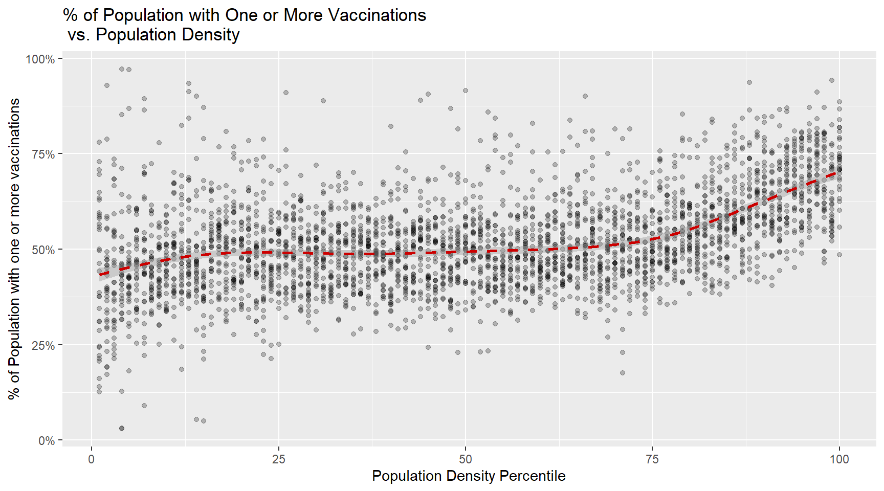
We will construct a graph that summarizes the vaccination rates by county compared to population density in the US using the following code:

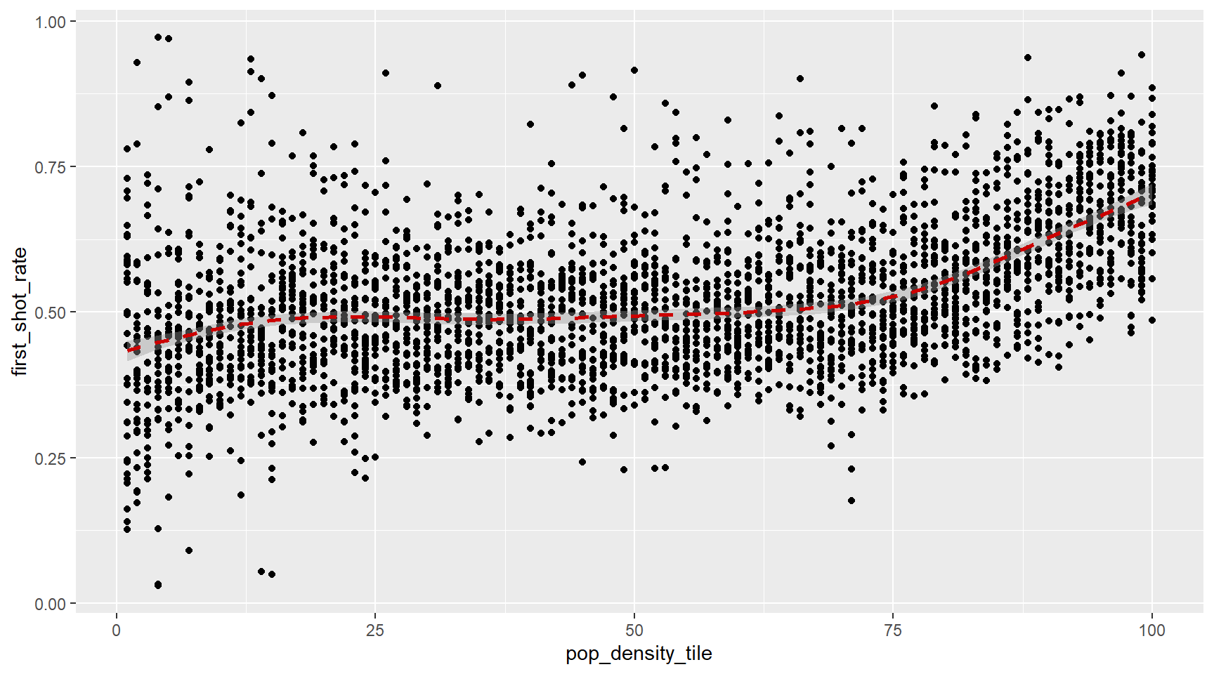
We can clearly that the effect of population density on vaccination rates does not kick in until the top 25% or so most dense counties.The code needed to make this plot is relatively simple. We will learn to create the plot part by part.
The first step in learning ggplot2 is to be able to break a graph apart into components. Let’s break down the plot above and introduce some of the ggplot2 terminology. The main three components to note are:
- Data: COVID vaccination rates by county and population densities are the source data for this plot. We refer to this as the data component.
- Geometry: The plot above is a scatterplot. This is referred to as the geometry component. Other possible geometries are barplot, histogram, smooth densities, qqplot, and boxplot. A complete list of geometries is provided in the cheat sheet.
- Aesthetic mapping: The plot uses several visual cues to represent the information provided by the dataset. The two most important cues in this plot are the point positions on the x-axis and y-axis, which represent population size and the total number of murders, respectively. Each point represents a different observation, and we map data about these observations to visual cues like x- and y-scale. Color is another visual cue that we will use in future plots. We refer to this as the aesthetic mapping component. How we define the mapping depends on what geometry we are using.
We also note that:
- The range of the x-axis and y-axis appears to be defined by the range of the data. They are both labeled as percentage scales.
- There are labels, a title, a legend, and we use the style of The Financial Times.
We will now construct the plot piece by piece. We already loaded in the data, so one step is out of the way.
ggplot objects
The first step in creating a ggplot2 graph is to define a ggplot object. We do this with the function ggplot, which initializes the graph. If we read the help file for this function, we see that the first argument is used to specify what data is associated with this object:
ggplot(data = recent_county_ts)
We can also pipe the data in as the first argument. So this line of code is equivalent to the one above:
recent_county_ts %>% ggplot()

It renders a plot, in this case a blank slate since no geometry has been defined. The only style choice we see is a grey background.
What has happened above is that the object was created and, because it was not assigned, it was automatically evaluated. But we can assign our plot to an object, for example like this:
p <- ggplot(data = recent_county_ts)
class(p)
[1] "gg" "ggplot"To render the plot associated with this object, we simply print the object p. The following two lines of code each produce the same plot we see above:
print(p)
p
Geometries
In ggplot2 we create graphs by adding layers. Layers can define geometries, compute summary statistics, define what scales to use, or even change styles. To add layers, we use the symbol +. In general, a line of code will look like this:
DATA %>%
ggplot()+ LAYER 1 + LAYER 2 + … + LAYER N Usually, the first added layer defines the geometry. We want to make a scatterplot. What geometry do we use?
Taking a quick look at the cheat sheet, we see that the function used to create plots with this geometry is geom_point.
Geometry function names follow the pattern: geom_X where X is the name of the geometry. Some examples include geom_point, geom_bar, and geom_histogram.
For geom_point to run properly we need to provide data and a mapping. We have already connected the object p with the recent_count_ts data table, and if we add the layer geom_point it defaults to using this data. To find out what mappings are expected, we read the Aesthetics section of the help file geom_point help file:
> Aesthetics
>
> geom_point understands the following aesthetics (required aesthetics are in bold):
>
> x
>
> y
>
> alpha
>
> colour
and, as expected, we see that at least two arguments are required x and y.
Aesthetic mappings
Aesthetic mappings describe how properties of the data connect with features of the graph, such as distance along an axis, size, or color. The aes function connects data with what we see on the graph by defining aesthetic mappings and will be one of the functions you use most often when plotting. The outcome of the aes function is often used as the argument of a geometry function. This example produces a scatterplot of total murders versus population in millions:
recent_county_ts %>% ggplot() +
  geom_point(aes(x = pop_density_tile, y = first_shot_rate))
We can drop the x = and y = if we wanted to since these are the first and second expected arguments, as seen in the help page.
Instead of defining our plot from scratch, we can also add a layer to the p object that was defined above as p <- ggplot(data = recent_county_ts):
p + geom_point(aes(pop_density_tile, first_shot_rate))
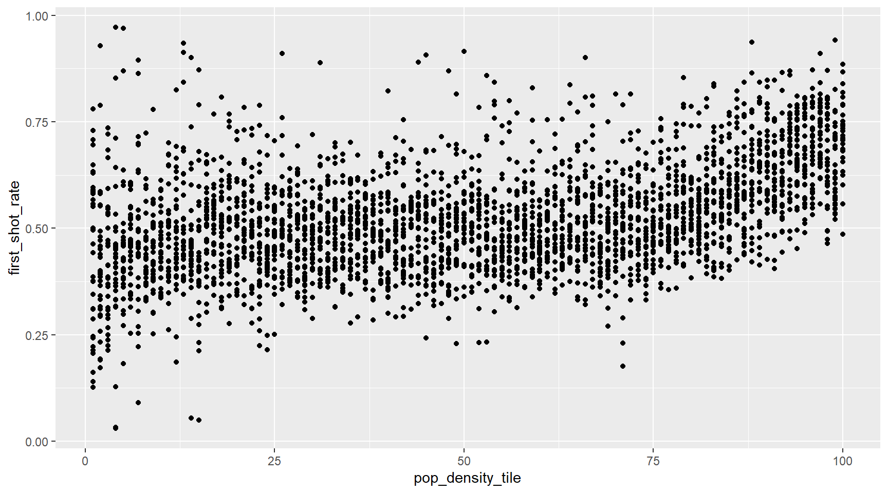
The scale and labels are defined by default when adding this layer. Like dplyr functions, aes also uses the variable names from the object component: we can use pop_density_tile and first_shot_rate without having to call them as recent_county_ts$pop_density_tile and recent_county_ts$first_shot_rate. The behavior of recognizing the variables from the data component is quite specific to aes. With most functions, if you try to access the values of pop_density_tile or first_shot_rate outside of aes you receive an error.
Layers
A second layer in the plot we wish to make involves adding a label to each point to identify the state. The geom_label and geom_text functions permit us to add text to the plot with and without a rectangle behind the text, respectively.
If we want to add in the Loess smoothed line, all we need to do is add a geom_smooth() layer. So the code looks like this:
p + geom_point(aes(pop_density_tile, first_shot_rate)) +
  geom_smooth(aes(pop_density_tile, first_shot_rate),lty=2,color=ft_colors('crimson'))
We have successfully added a second layer to the plot.
Tinkering with arguments
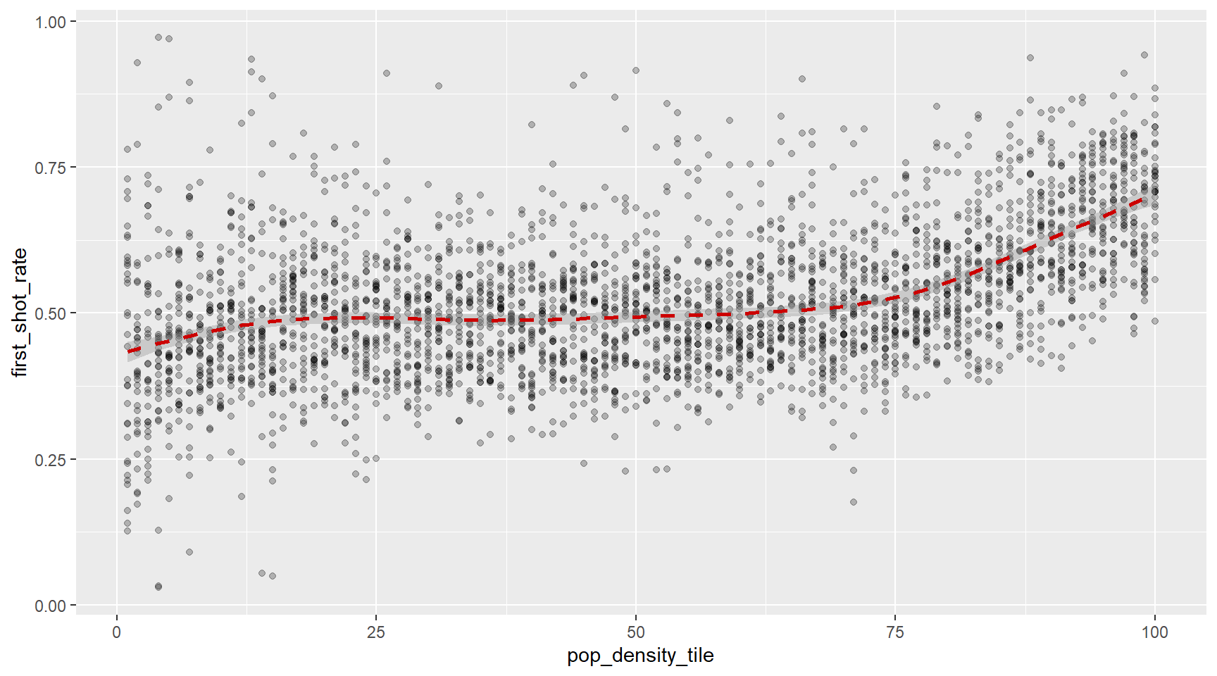
Each geometry function has many arguments other than aes and data. They tend to be specific to the function. For example, in the plot we wish to make, we want to make the smoothed line dashed and change the color to FT crimson. We can change it like this, using the lty (linetype) and color parameters, outside of the aes() call. We can also make the points semi-transparent using the alpha argument.
p + geom_point(aes(pop_density_tile, first_shot_rate), alpha=0.25) +
  geom_smooth(aes(pop_density_tile, first_shot_rate),lty=2,color=ft_colors('crimson'))
Global versus local aesthetic mappings
In the previous line of code, we define the mapping aes(pop_density_tile, first_shot_rate) twice, once in each geometry. We can avoid this by using a global aesthetic mapping. We can do this when we define the blank slate ggplot object. Remember that the function ggplot contains an argument that permits us to define aesthetic mappings:
args(ggplot)
function (data = NULL, mapping = aes(), ..., environment = parent.frame())
NULL
If we define a mapping in ggplot, all the geometries that are added as layers will default to this mapping. We redefine p:
p <- recent_county_ts %>% ggplot(aes(pop_density_tile, first_shot_rate))
and then we can simply write the following code to produce the previous plot:
p + geom_point(alpha=0.25) +
  geom_smooth(lty=2,color=ft_colors('crimson'))
Scales
First, our desired y axis is in labeled using the percent() function from the scales package. This is not the default, so this change needs to be added through a scales layer. A quick look at the cheat sheet reveals the scale_x_continuous function lets us control the behavior of scales. We use them like this:
p + geom_point() +
  geom_smooth(lty=2,color=ft_colors('crimson'))+
  scale_y_continuous(labels=percent)
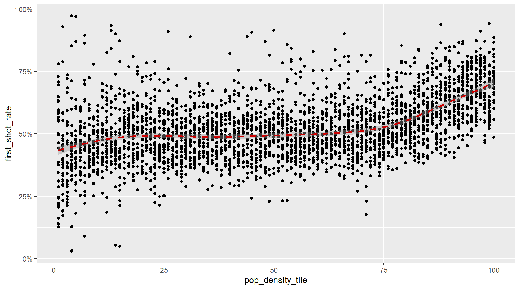
Labels and titles
Similarly, the cheat sheet quickly reveals that to change labels and add a title, we use the following functions:
plt <- p + geom_point(alpha=0.25) +
  geom_smooth(lty=2,color=ft_colors('crimson'))+
  scale_y_continuous(labels=percent)+
  xlab('Population Density Percentile')+
  ylab('% of Population with one or more vaccinations')+
  ggtitle('% of Population with One or More Vaccinations\n vs. Population Density')

plt

We are almost there! All we have left to do is change the theme. There is more you can do to modify a ggplot we’ll explore further on in this module, and is covered in the cheat sheet.
Themes
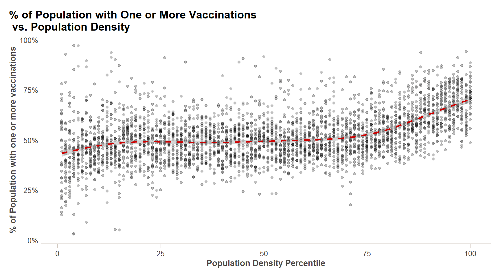
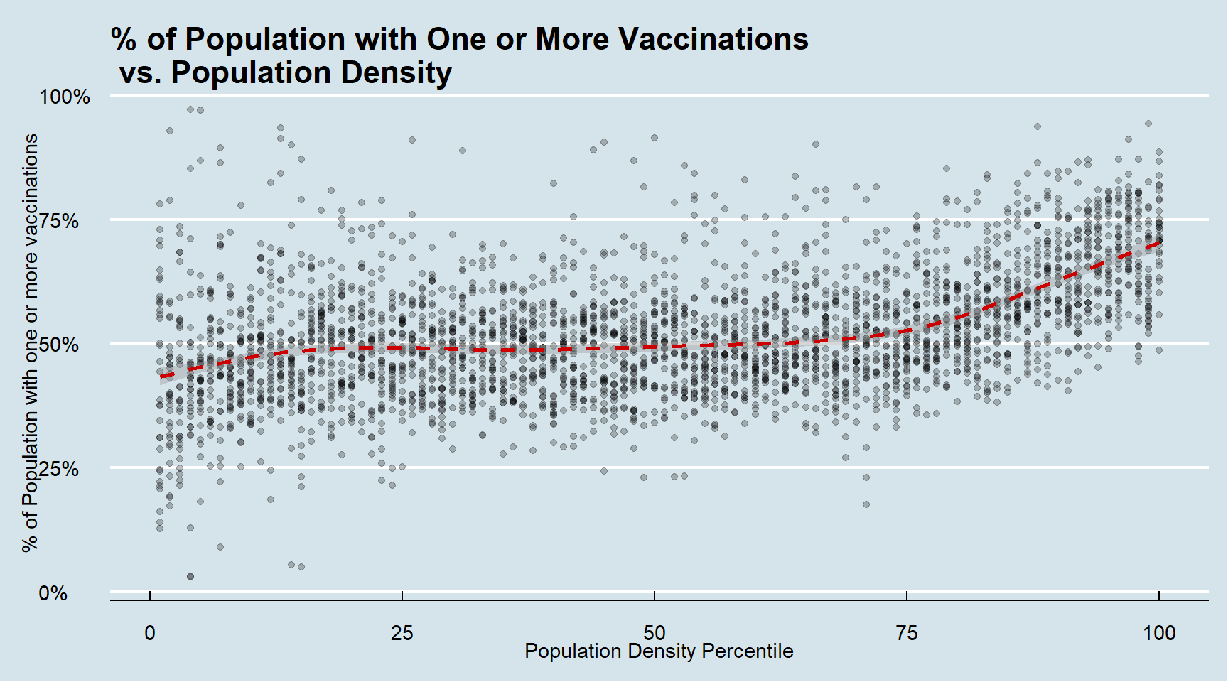
You can also use customized themes which will set many background styling parameters of your plot. You can modify these parameters yourself, but these are beyond the scope of this module. We can try a few themes below, and we’re going to use FT’s theme for the rest of this module.
#The Financial Times
plt + ft_theme()
#The Economist
plt + theme_economist()
#FiveThirtyEight
plt + theme_fivethirtyeight()

#Wall Street Journal
plt + theme_wsj()

You can see how some of the other themes look by simply changing the function. For instance, you might try the theme_fivethirtyeight() theme from the ggthemes package instead.
Putting it all together
Now that we are done testing, we can write one piece of code that produces our desired plot from scratch.
ggplot(recent_county_ts,aes(x=pop_density_tile,y=first_shot_rate))+
  geom_point(alpha=0.25)+
  xlab('Population Density Percentile')+
  ylab('% of Population with one or more vaccinations')+
  scale_y_continuous(labels=percent)+
  geom_smooth(lty=2,color=ft_colors('crimson'))+
  ggtitle('% of Population with One or More Vaccinations\n vs. Population Density') +
  ftplottools::ft_theme()

Exploratory Data Analysis
Plotting’s most obvious use is for making graphs that communicate the results of your analysis to your audience, but they are also extremely useful for Exploratory Data Analysis (EDA). EDA is an iterative cycle. You:
Generate questions about your data.
Search for answers by visualising, transforming, and modelling your data.
Use what you learn to refine your questions and/or generate new questions.
EDA is not a formal process with a strict set of rules. More than anything, EDA is a state of mind. During the initial phases of EDA you should feel free to investigate every idea that occurs to you. Some of these ideas will pan out, and some will be dead ends. As your exploration continues, you will home in on a few particularly productive areas that you will eventually write up and communicate to others.
EDA is an important part of any data analysis, even if the questions are handed to you on a platter, because you always need to investigate the quality of your data. Data cleaning is just one application of EDA: you ask questions about whether your data meets your expectations or not. To do data cleaning, you will need to deploy all the tools of EDA: visualization, transformation, and modeling.
Single Variable Plots
What do county level vaccination rates look like? In this case, we want to visualize the distribution of a single variable - the proportion of each county’s residents that have received at least one COVID-19 vaccination. There are multiple single variable plots that can be used in ggplot2, but the one I am going to demonstrate is the histogram.
ggplot(recent_county_ts,aes(x=first_shot_rate))+
  geom_histogram()+
  ft_theme()
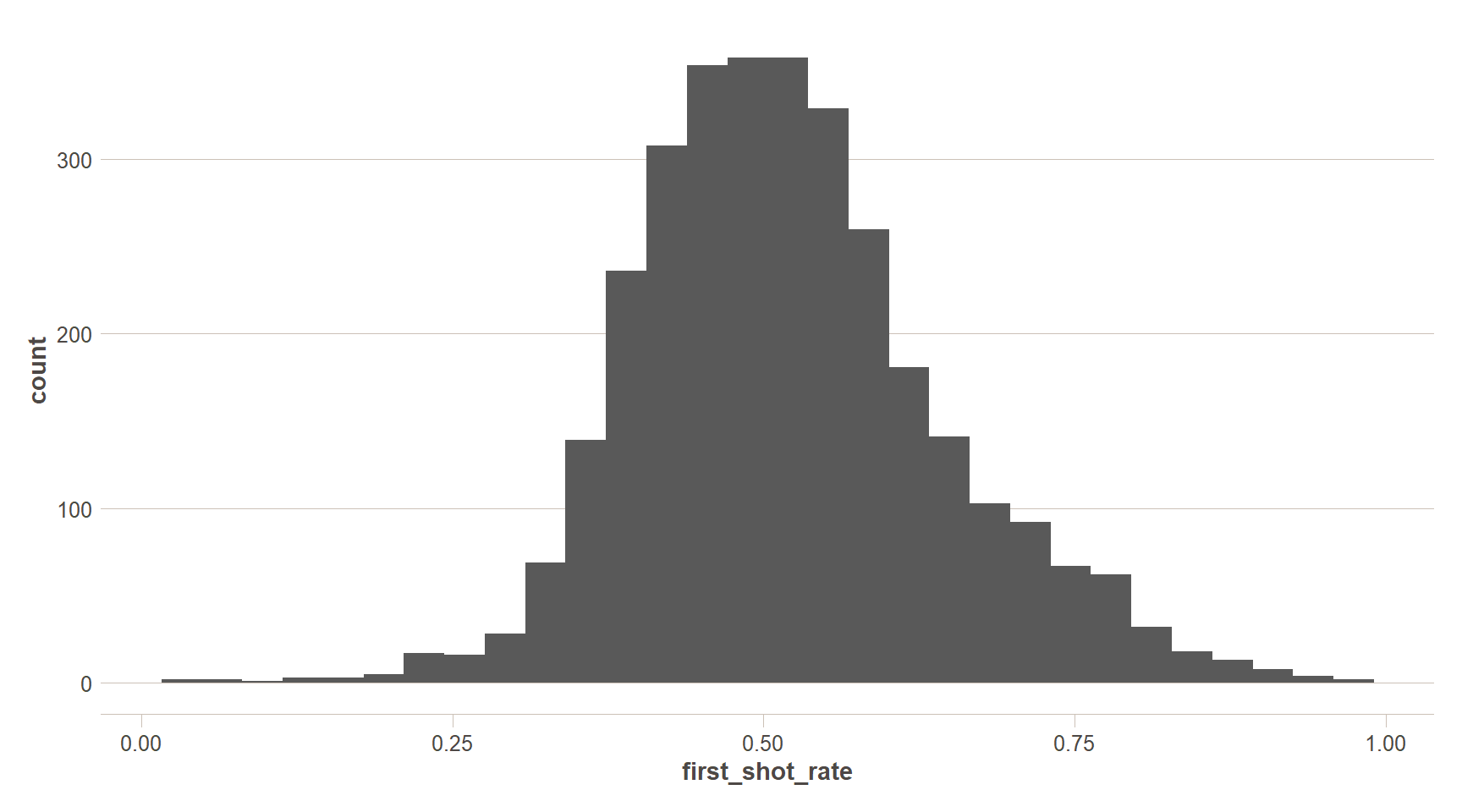
This plot is pretty basic. By default, the histogram uses 30 bins – that looks a little coarse and could be masking some variation in the distribution – let’s add some more bins. Let’s also make use of the additive nature of ggplot2 we learned about above to add some styling to the plot, as well as some more data. If you only want to use one dataset for your ggplot, you can enter that as the first parameter in your ggplot() call and that dataset will be referenced for every additional geom_x() function you call. Likewise with specifying aesthetics (i.e. the aes() call) – if you specify in the initial ggplot() call, those settings will be remembered for every additional call. If you want to set aesthetics specific to geometries, you can do that as well, like the below.
summary_stats = recent_county_ts %>%
  summarise(`Median` = median(first_shot_rate),
            `Mean` = mean(first_shot_rate),
            `5th Percentile` = quantile(first_shot_rate,0.05),
            `95th Percentile` = quantile(first_shot_rate,0.95)) %>%
  pivot_longer(cols = everything())

ggplot()+
  geom_histogram(data = recent_county_ts,aes(x=first_shot_rate),
                 bins=100)+
  geom_vline(data = summary_stats,aes(color=name,xintercept=value),
             lty=2,size=0.8)+
  scale_x_continuous(labels=percent,breaks = seq(0,1,0.1))+
  labs(x='% of County Population with at least one vaccination',
       y='# of Counties in Bin',
       title = paste0('County Level COVID-19 Vaccination Distribution as of ',Sys.Date()))+
  scale_color_brewer(palette = 'Set1',name='Statistic')+
  ft_theme()
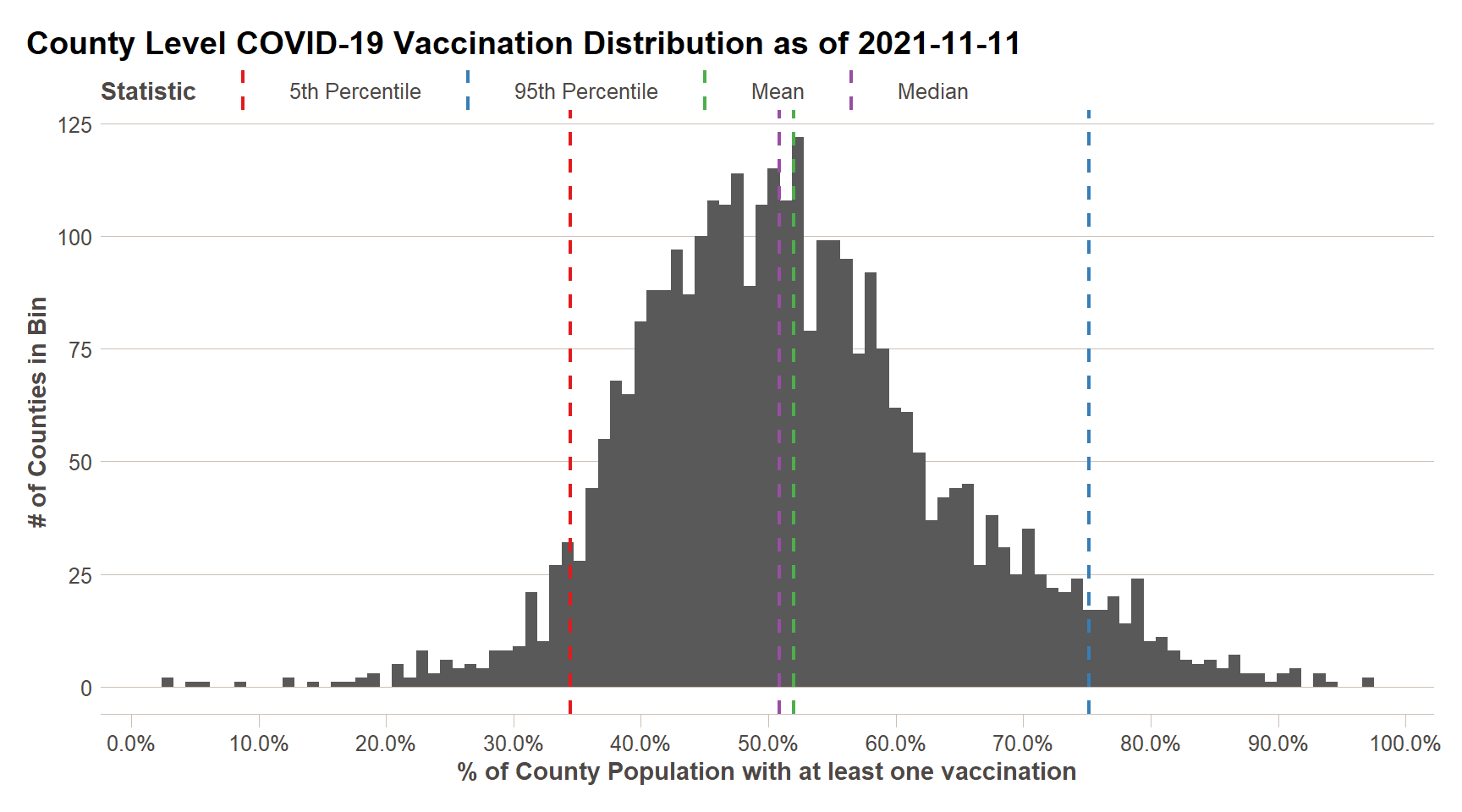
We can now see that our data is fairly close to a [normal] distribution – one in which the mean and median of the data are equivalent. We can see that approximately 50% of counties have vaccinations rates of 36% or greater, with the top 5% of counties having vaccination rates of 56% or greater.
Two Variable Plots
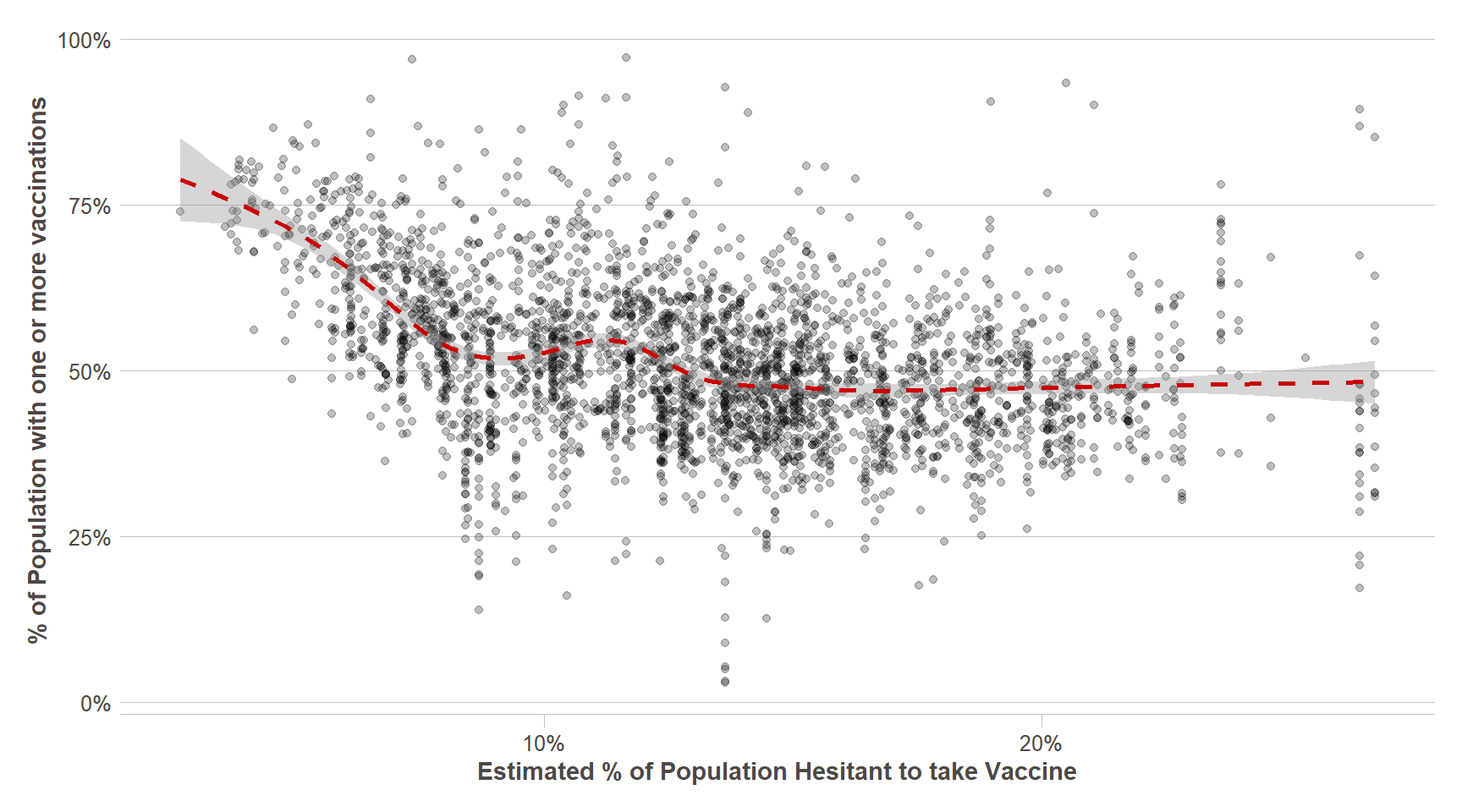
Single variable analysis is invaluable for understanding what your data look like without any preconceived notions about relationships between variables within the dataset. That said, typically what we are focused on in analysis projects is finding those relationships – EDA can be very helpful for this, and may illuminate relationships in the data that you did not realize existed, or may just confirm your hypothesis. In the above, tutorial, I hypothesized that there was a relationship between vaccination rates and population density. But we also have the results of the CDC’s vaccine hesitancy model – let’s also consider how their hesitancy model compares to vaccination rates.
ggplot(recent_county_ts,aes(x=pop_density_tile,y=first_shot_rate))+
  geom_point(alpha=0.25)+
  xlab('Population Density Percentile')+
  ylab('% of Population with one or more vaccinations')+
  scale_y_continuous(labels=percent)+
  geom_smooth(lty=2,color=ft_colors('crimson'))+
  ggtitle('% of Population with One or More Vaccinations\n vs. Population Density') +
  ftplottools::ft_theme()

vax_hes_data = recent_county_ts %>%
  left_join(county_vax_hes %>%
              mutate(fips_code = str_pad(fips_code,width = 5,side='left',pad='0')))

ggplot(vax_hes_data,aes(x=estimated_hesitant,y=first_shot_rate)) +
  geom_point(alpha=0.25) +
  geom_smooth(lty=2,color=ft_colors('crimson')) +
  scale_y_continuous(labels = percent)+
  scale_x_continuous(labels = percent)+
  ftplottools::ft_theme()+
  xlab('Estimated % of Population Hesitant to take Vaccine')+
  ylab('% of Population with one or more vaccinations')
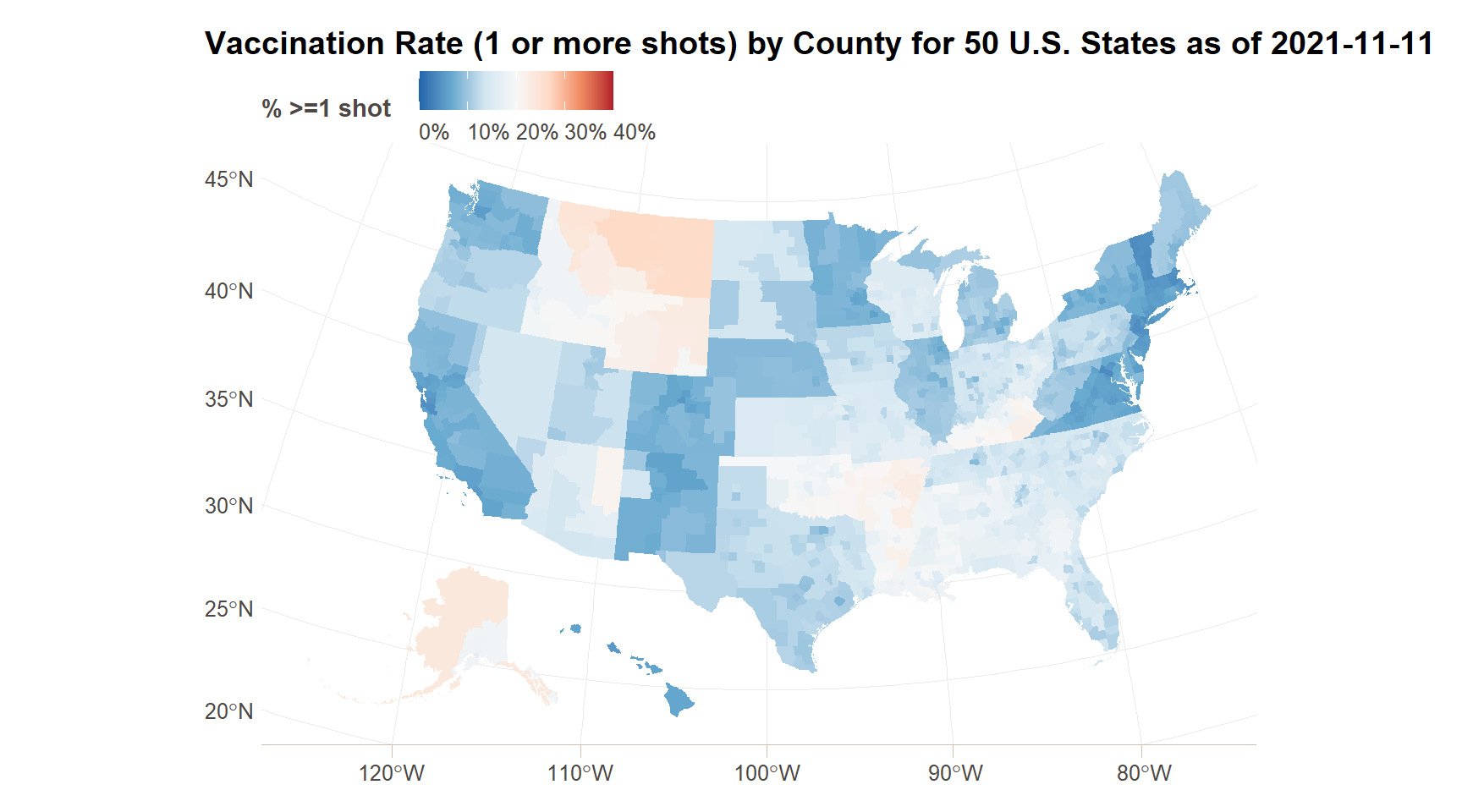
Spatial Plotting
When we are considering data by county (or any other geographic unit of analysis), we also want to consider the spatial distribution of the data, when exploring it. When looking at the map below, can you come up with any additional potential explanatory variables for the geographic variation in vaccination rates and hesitancy based on the maps?
vax_hes_with_geom = counties_map %>%
  select(county_fips,geometry) %>%
  rename(fips_code = county_fips) %>%
  left_join(recent_county_ts) %>%
  left_join(county_vax_hes %>%
              mutate(fips_code = str_pad(fips_code,width = 5,side='left',pad='0')))

#Vaccination rate
ggplot(vax_hes_with_geom,aes(fill=first_shot_rate))+
  geom_sf(size=NA)+ #Size = NA to remove borders between counties
  scale_fill_distiller(palette = 'RdYlGn',direction = 1, #Using a preset color palette from ColorBrewer
                       limits = c(0,0.85),
                       labels=function(x){percent(x,accuracy = 1)}, #Changing labels to percentages
                       name='% >=1 shot')+
  ggtitle(paste0('Vaccination Rate (1 or more shots) by County for 50 U.S. States as of ',Sys.Date()))+
  ftplottools::ft_theme()

#Vaccination hesitancy
ggplot(vax_hes_with_geom,aes(fill=estimated_hesitant))+
  geom_sf(size=NA)+ #Size = NA to remove borders between counties
  scale_fill_distiller(palette = 'RdBu',direction = -1, #Using a preset color palette from ColorBrewer
                       limits = c(0,0.4),
                       labels=function(x){percent(x,accuracy = 1)}, #Changing labels to percentages
                       name='% >=1 shot')+
  ggtitle(paste0('Vaccination Rate (1 or more shots) by County for 50 U.S. States as of ',Sys.Date()))+
  ftplottools::ft_theme()
More Variables
Often times, we will want to see the relationships among more than two variables. While there are three (and more) dimensional plotting packages out there, ggplot adds more dimensions using a couple of techniques – a) colors, sizes, and other geometry aesthetics, and b) facets. We are going to demonstrate both to the below to consider population density, vaccination rate, and vaccination hesitancy all in the same plot. We noticed above that the variation in vaccination rate doesn’t kick in until higher population densities – so I am going to transform that variable into a decile (ten groups) rather than a percentile (one hundred groups).
data_more_vars = vax_hes_data %>%
  mutate(pop_density_decile = factor(ntile(pop_density,10)))

ggplot(data_more_vars, aes(x = estimated_hesitant, y = first_shot_rate,
                           color = pop_density_decile,
                           fill = pop_density_decile)) +
  geom_point(alpha = 0.1) +
  geom_smooth(lty = 2) +
  scale_y_continuous(labels = percent)+
  scale_x_continuous(labels = percent) +
  facet_wrap(~pop_density_decile) +
  ft_theme() +
  labs(
    x = 'Vaccine Hestinacy Rate (%)',
    y= '% of Population with one or more vaccinations',
    title='Vaccination rate by Population Density Group and Vaccine Hesitancy',
    subtitle = "1 = Lowest 10% population density counties\n10 = Highest 10% population density counties"
  )
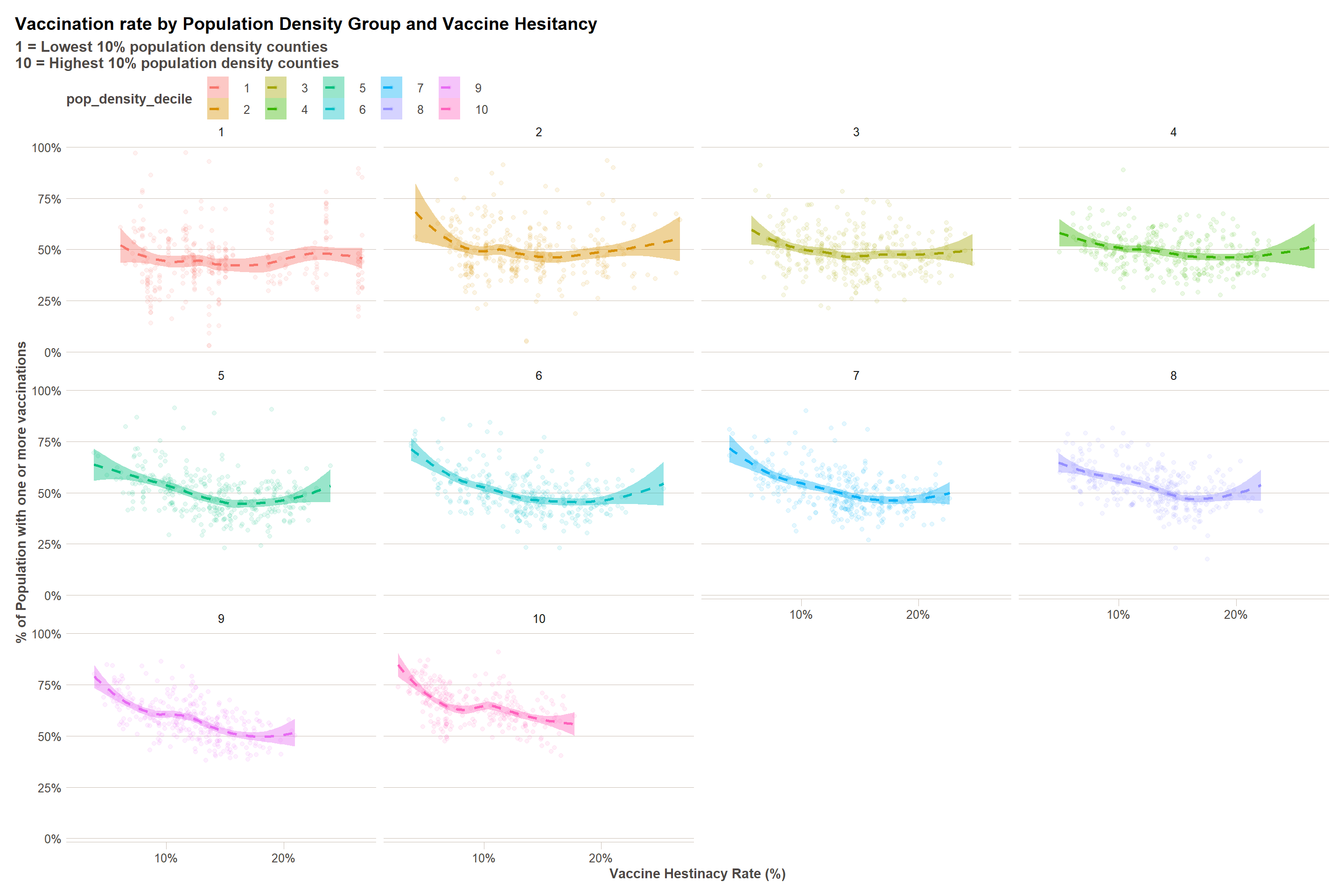
We can see in the above that there is definitely a different hesitancy effect across differen population densities. To understand these effects in a more detailed way, we will have to turn to tools to quantify relationships within data – namely, statistical models.
Intro to Quantifying Relationships
We can spend future modules just scratching the surface of statistical modelling – it is a deep and wide topic. But to give you a sense of the power of the tool to motivate future learning and consideration of its use in your projects, we will test some models below. We will use only linear models and a technique called stepwise regression, which removes variables from the model that do not add any additional explanatory power in a stepwise procedure.
base_model = lm(first_shot_rate ~ pop_density + estimated_hesitant + estimated_strongly_hesitant +
             estimated_hesitant * estimated_strongly_hesitant +
               pop_density * estimated_hesitant +
               pop_density * estimated_strongly_hesitant,
   data = data_more_vars)

base_model %>% tab_model()
| first shot rate | |||
|---|---|---|---|
| Predictors | Estimates | CI | p |
| (Intercept) | 0.79 | 0.77 – 0.82 | <0.001 |
| pop_density | -0.00 | -0.00 – -0.00 | <0.001 |
| estimated_hesitant | -3.28 | -3.67 – -2.89 | <0.001 |
| estimated_strongly_hesitant | -0.36 | -0.98 – 0.27 | 0.262 |
|
estimated_hesitant * estimated_strongly_hesitant |
13.84 | 11.88 – 15.80 | <0.001 |
|
pop_density * estimated_hesitant |
0.00 | 0.00 – 0.00 | <0.001 |
|
pop_density * estimated_strongly_hesitant |
-0.00 | -0.00 – -0.00 | <0.001 |
| Observations | 3135 | ||
| R2 / R2 adjusted | 0.229 / 0.228 | ||
stepped_model = step(base_model,trace=0) # Do not print interim model results to keep markdown manageable

stepped_model %>% tab_model()
| first shot rate | |||
|---|---|---|---|
| Predictors | Estimates | CI | p |
| (Intercept) | 0.79 | 0.77 – 0.82 | <0.001 |
| pop_density | -0.00 | -0.00 – -0.00 | <0.001 |
| estimated_hesitant | -3.28 | -3.67 – -2.89 | <0.001 |
| estimated_strongly_hesitant | -0.36 | -0.98 – 0.27 | 0.262 |
|
estimated_hesitant * estimated_strongly_hesitant |
13.84 | 11.88 – 15.80 | <0.001 |
|
pop_density * estimated_hesitant |
0.00 | 0.00 – 0.00 | <0.001 |
|
pop_density * estimated_strongly_hesitant |
-0.00 | -0.00 – -0.00 | <0.001 |
| Observations | 3135 | ||
| R2 / R2 adjusted | 0.229 / 0.228 | ||
The vaccine hesitancy data also includes additional race variables, which might have been occurred to you as a reason for the variation we saw in the maps above. I’m going to include those variables in the model below and see what comes out as significant.
base_model = lm(first_shot_rate ~ pop_density + estimated_hesitant + estimated_strongly_hesitant +
             estimated_hesitant * estimated_strongly_hesitant +
               percent_hispanic + percent_non_hispanic_american_indian_alaska_native +
               percent_non_hispanic_asian + percent_non_hispanic_black +
               percent_non_hispanic_native_hawaiian_pacific_islander +
               percent_non_hispanic_white,
   data = data_more_vars)

base_model %>% tab_model()
| first shot rate | |||
|---|---|---|---|
| Predictors | Estimates | CI | p |
| (Intercept) | 1.10 | 0.86 – 1.34 | <0.001 |
| pop_density | 0.00 | -0.00 – 0.00 | 0.125 |
| estimated_hesitant | -2.37 | -2.75 – -1.99 | <0.001 |
| estimated_strongly_hesitant | -0.13 | -0.73 – 0.47 | 0.678 |
| percent_hispanic | -0.34 | -0.58 – -0.09 | 0.007 |
| percent_non_hispanic_american_indian_alaska_native | -0.36 | -0.62 – -0.10 | 0.007 |
| percent_non_hispanic_asian | 0.70 | 0.38 – 1.03 | <0.001 |
| percent_non_hispanic_black | -0.32 | -0.57 – -0.07 | 0.012 |
| percent_non_hispanic_native_hawaiian_pacific_islander | -2.94 | -4.13 – -1.76 | <0.001 |
| percent_non_hispanic_white | -0.42 | -0.66 – -0.17 | 0.001 |
|
estimated_hesitant * estimated_strongly_hesitant |
8.85 | 6.88 – 10.83 | <0.001 |
| Observations | 3135 | ||
| R2 / R2 adjusted | 0.278 / 0.276 | ||
stepped_model = step(base_model,trace=0) # Do not print interim model results to keep markdown manageable

stepped_model %>% tab_model()
| first shot rate | |||
|---|---|---|---|
| Predictors | Estimates | CI | p |
| (Intercept) | 1.10 | 0.86 – 1.34 | <0.001 |
| pop_density | 0.00 | -0.00 – 0.00 | 0.125 |
| estimated_hesitant | -2.37 | -2.75 – -1.99 | <0.001 |
| estimated_strongly_hesitant | -0.13 | -0.73 – 0.47 | 0.678 |
| percent_hispanic | -0.34 | -0.58 – -0.09 | 0.007 |
| percent_non_hispanic_american_indian_alaska_native | -0.36 | -0.62 – -0.10 | 0.007 |
| percent_non_hispanic_asian | 0.70 | 0.38 – 1.03 | <0.001 |
| percent_non_hispanic_black | -0.32 | -0.57 – -0.07 | 0.012 |
| percent_non_hispanic_native_hawaiian_pacific_islander | -2.94 | -4.13 – -1.76 | <0.001 |
| percent_non_hispanic_white | -0.42 | -0.66 – -0.17 | 0.001 |
|
estimated_hesitant * estimated_strongly_hesitant |
8.85 | 6.88 – 10.83 | <0.001 |
| Observations | 3135 | ||
| R2 / R2 adjusted | 0.278 / 0.276 | ||
Per the R-squared, this model explains approximately 29% of the variation in county-level vaccination rates, leaving 61% of the variation unexplained.
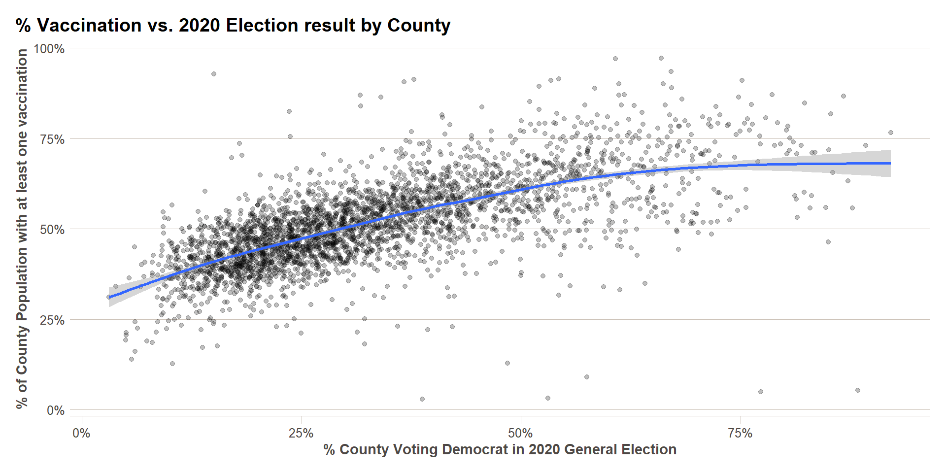
Bonus: Including 2020 Election Results
It may have also occurred to you (as it did to me) that some of the variation in the map above is due to political polarization in the U.S. For that reason, I am going to test the use of the topline voting result in the 2020 U.S. general presidential election in each county as an index for political polarization. After testing a few models, I also saw that election participation – votes per capita – also had a significant effect. There are many much more sophisticated researchers on these topics to be found online if they are of interest, I just thought the obvious (to me) explanatory factor bore mentioning.
us_2020_county_elec_results = read_csv('https://raw.githubusercontent.com/tonmcg/US_County_Level_Election_Results_08-20/master/2020_US_County_Level_Presidential_Results.csv')

vax_w_elex = data_more_vars %>%
  left_join(us_2020_county_elec_results %>%
              select(county_fips,total_votes,votes_dem,per_dem) %>%
              rename(fips_code = county_fips)) %>%
  mutate(votes_per_capita = total_votes/population)

ggplot(vax_w_elex,aes(x=per_dem,y=first_shot_rate))+
  geom_point(alpha=0.25)+
  geom_smooth()+
  scale_x_continuous(labels=percent)+
  scale_y_continuous(labels=percent)+
  labs(x = '% County Voting Democrat in 2020 General Election',
       y = '% of County Population with at least one vaccination',
       title = '% Vaccination vs. 2020 Election result by County')+
  ft_theme()
base_model = lm(first_shot_rate ~ pop_density + estimated_hesitant + estimated_strongly_hesitant +
                estimated_hesitant * estimated_strongly_hesitant +
                percent_hispanic + percent_non_hispanic_american_indian_alaska_native +
                percent_non_hispanic_asian + percent_non_hispanic_black +
                percent_non_hispanic_native_hawaiian_pacific_islander +
                percent_non_hispanic_white +
                votes_per_capita + per_dem,
   data = vax_w_elex)

base_model %>% tab_model()
| first shot rate | |||
|---|---|---|---|
| Predictors | Estimates | CI | p |
| (Intercept) | 0.41 | 0.22 – 0.60 | <0.001 |
| pop_density | -0.00 | -0.00 – 0.00 | 0.523 |
| estimated_hesitant | -1.18 | -1.48 – -0.89 | <0.001 |
| estimated_strongly_hesitant | 1.85 | 1.39 – 2.32 | <0.001 |
| percent_hispanic | -0.10 | -0.30 – 0.09 | 0.297 |
| percent_non_hispanic_american_indian_alaska_native | -0.40 | -0.61 – -0.19 | <0.001 |
| percent_non_hispanic_asian | 0.03 | -0.23 – 0.29 | 0.831 |
| percent_non_hispanic_black | -0.41 | -0.60 – -0.22 | <0.001 |
| percent_non_hispanic_native_hawaiian_pacific_islander | -1.13 | -2.05 – -0.22 | 0.015 |
| percent_non_hispanic_white | -0.19 | -0.39 – 0.01 | 0.058 |
| votes_per_capita | 0.23 | 0.19 – 0.27 | <0.001 |
| per_dem | 0.57 | 0.55 – 0.60 | <0.001 |
|
estimated_hesitant * estimated_strongly_hesitant |
-0.19 | -1.76 – 1.37 | 0.809 |
| Observations | 3107 | ||
| R2 / R2 adjusted | 0.584 / 0.582 | ||
stepped_model = step(base_model,trace=0) # Do not print interim model results to keep markdown manageable

stepped_model %>% tab_model()
| first shot rate | |||
|---|---|---|---|
| Predictors | Estimates | CI | p |
| (Intercept) | 0.42 | 0.32 – 0.52 | <0.001 |
| estimated_hesitant | -1.19 | -1.46 – -0.93 | <0.001 |
| estimated_strongly_hesitant | 1.81 | 1.44 – 2.19 | <0.001 |
| percent_hispanic | -0.11 | -0.21 – -0.01 | 0.035 |
| percent_non_hispanic_american_indian_alaska_native | -0.41 | -0.52 – -0.30 | <0.001 |
| percent_non_hispanic_black | -0.42 | -0.52 – -0.32 | <0.001 |
| percent_non_hispanic_native_hawaiian_pacific_islander | -1.10 | -1.98 – -0.22 | 0.014 |
| percent_non_hispanic_white | -0.20 | -0.30 – -0.09 | <0.001 |
| votes_per_capita | 0.23 | 0.19 – 0.27 | <0.001 |
| per_dem | 0.57 | 0.55 – 0.60 | <0.001 |
| Observations | 3107 | ||
| R2 / R2 adjusted | 0.584 / 0.583 | ||
This final model explains 60% of the variation in vaccination rates, which approximately double the 29% we had before. That leaves 40% of the variation unexplained. Feel free to try to come up with additional explanatory factors!
This content was presented to Nelson\Nygaard Staff at a GIS Hangout on Wednesday, May 26th, 2021, and is available as a recording here and embedded above.