This content was presented to Nelson\Nygaard Staff at a Lunch and Learn webinar on Thursday, October 28th, 2021, and is available as a recording here and embedded below.
Introduction
Today we’re going to briefly introduce time series data analysis methods. We will not dive too deeply into statistical modeling – this is a deep topic well addressed by courses linked at the bottom of the unit. This unit hopes to give you a) a clear understanding of what time series data is, and b) key considerations for its analysis.
Because it is easy to obtain, a rich time series dataset, and relevant to everyone (despite being somewhat morbid), we’re going to be using COVID-related data to demonstrate the use of introductory time series analysis methods. You can use the methods discussed here for data you are more likely to look at on a project – e.g., the daily boardings at a particular bus stop over time, or the hourly bike share trips generated in a given location.
What is Time Series Data?
So what do I mean by time series? Time series data are observations of a measured variable associated with a particular time unit - e.g. day, hour, minute. When we are exploring or analyzing data (refer back to our unit on Exploratory Data Analysis), we are typically trying to understand the relationships between one or more dependent variables (e.g., bike share trips generated) and non-time independent variables (e.g., location, bike share subscription type). And yet, there are temporal effects that appear in the data if it is taking place over time. With time series analysis we are usually trying to control for these temporal effects, either to remove them entirely from our comparisons or to include them in a predictive model along with other independent variables, so that we can understand the effects of the other independent variables apart from the temporal effects.
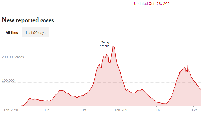
COVID data is a great example of how elementary time series methods are used in a popular/everyday context. We are probably all familiar with some version the below chart (this one from New York Times) – a seven-day moving average of total COVID cases reported in the U.S. They are using the seven-day moving average to smooth the data and decrease/remove the effects of variation by day of week in COVID case reporting. If you look at raw daily data, you can clearly see that less cases are reported on weekends (we will check this out shortly). Even with the seven-day average curve, you can still see some volatility in the case curve due to temporal effects – the zig-zag in early/mid September is due to Labor Day effects, and the two dips in the winter 2020-2021 curve are due to holidays (Thanksgiving and Christmas). This is a relatively easy way to ‘de-trend’ data – to remove a temporal effect so you can more clearly see the underlying trend. We will return to this idea in the content below.
A Note on Packages
There are many packages out there for dealing with time series data – alternatives will be addressed in the reference materials – but I am making the decision to demonstrate the use of time series data packages designed intentionally to work with the tidyverse family of packages (e.g., dplyr, ggplot2). R has been around since the early 90s and other time series packages developed before the tidyverse became prominent (2015-2016) have extensive legacy usage, such as xts and zoo. It is good to be aware of these other packages, but if you are relatively new to learning R, sticking with the tidyverse will make your R usage easier overall.
Fetching Our Data
Before we delve into time series topics, we will take a brief interlude to fetch our COVID data, in a fashion similar to that I had done in our unit on Exploratory Data Analysis. We’re going to be relying on the COVID Act Now API, which is rich with data and free to use on a limited basis. As before, register for an API key here.
library(tidyverse)
library(tsibble)
library(janitor)
library(lubridate)
library(feasts)
library(ftplottools)
library(scales)
library(zoo)

today_date = today()

#Read in your inidividual API Key here
covid_api_key = readLines('data/COVID-api-key.txt')

#Historic time series
query_url = paste0('https://api.covidactnow.org/v2/counties.timeseries.csv?apiKey=',covid_api_key)
county_ts = read_csv(query_url) %>% clean_names()

#Grab current data as a quick way of getting county level populations
query_url = paste0('https://api.covidactnow.org/v2/counties.csv?apiKey=',covid_api_key)
county_pops = read_csv(query_url) %>% clean_names() %>%
  select(fips,population)

#Totals for entire U.S.
us_ts = county_ts %>%
  group_by(date) %>%
  summarise_at(.vars = vars(contains("actuals_")),
               .funs = sum,
               na.rm=TRUE) %>%
  filter(date <= (today_date-2) &
           date >= as.Date("2020-02-01")) %>%
  as_tsibble(index="date")
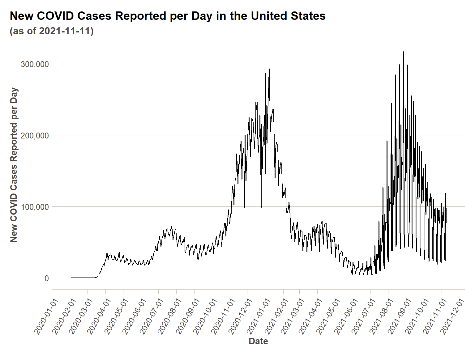
First we are going to show how our data looks on a time series plot as-is, and then in the next section we’ll do some cleaning.
ggplot(us_ts, aes(x = date,y=actuals_new_cases))+
  geom_line()+
  scale_y_continuous(labels = comma)+
  scale_x_date(breaks = date_breaks("1 month"))+
  ft_theme()+
  labs(
    x = "Date",
    y = "New COVID Cases Reported per Day",
    title = "New COVID Cases Reported per Day in the United States",
    subtitle = paste0("(as of ",today(),")")
  )+
  theme(axis.text.x = element_text(angle = 60,hjust=1))
Decomposing Time Series Data
Low-Tech Decomposition
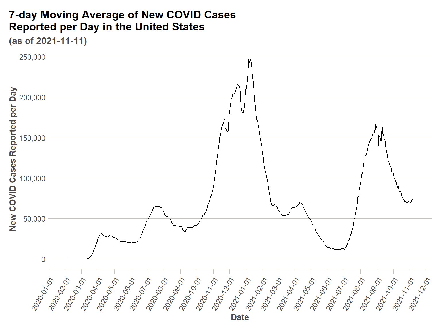
As alluded to in the introduction, we can see the zig-zagginess of the day-of-week variation adding some ‘noise’ to our data. In order to get closer to understanding the trend of COVID cases apart from temporal effects, we will need to remove this noise. First, we are going to do a simple mathematical moving average of seven days, as in the NYTimes plot. Then we are going to show that what we are actually doing is a generalizable technique for time series data.
us_ts_avg = us_ts %>%
  mutate(ma_actuals_new_cases = rollmean(actuals_new_cases,k=7, fill = NA))

ggplot(us_ts_avg, aes(x = date,y=ma_actuals_new_cases))+
  geom_line()+
  scale_y_continuous(labels = comma)+
  scale_x_date(breaks = date_breaks("1 month"))+
  ft_theme()+
  labs(
    x = "Date",
    y = "New COVID Cases Reported per Day",
    title = "7-day Moving Average of New COVID Cases\nReported per Day in the United States",
    subtitle = paste0("(as of ",today(),")")
  )+
  theme(axis.text.x = element_text(angle = 60,hjust=1))

Generalized Decomposition
In the case of COVID stats, we have become so used to seeing it represented as a 7-day moving average that doing so is intuitive, but what if it was not? Below we will discuss how to identify cyclical trends in your data that might be helpful to decompose, and then demonstrate some decomposition.
Assessing Need for Decomposition
To empirically understand if data need to be decomposed, you must understand how your measurements are related to each other over time. Typically, COVID cases will be high the day after another day that had high COVID cases – this is a trivial observation, and yet it must be accounted for in your data. Without getting to into the weeds on regression analysis (potentially a topic for a future webinar if there is interest), an explicit assumption in many types of statistical analysis is that errors in observations are randomly distributed and thus not correlated. Temporal autocorrelation (and its geographic counterpart also typically present in COVID data, spatial autocorrelation) violates this assumption if it is not controlled for in statistical analysis. While this module is meant to just provide an intro to time series analysis and not dive into statistical modeling/analysis, it is an issue everyone doing any level of time series analysis should be aware of.
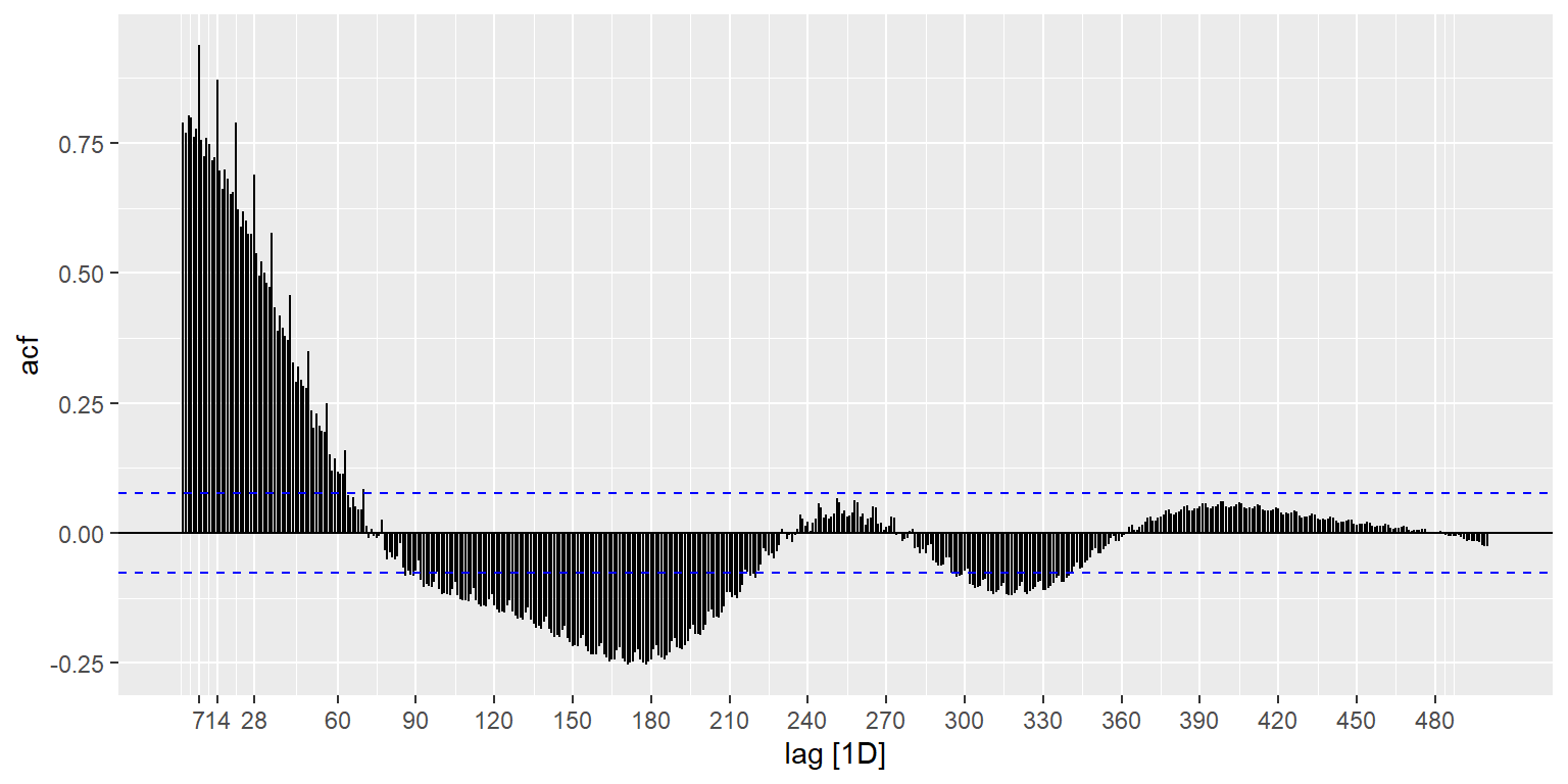
The ACF() function computes autocorrelation estimates for however great of a lag (i.e., number of time units apart to compute correlations for) you are interested in understanding. While there are many exogenous factors that affect COVID case trends over time, I am guessing there may be both weekly and annual (or some sort of semi-annual) cycle effects. This is tough because we have less than two years of data, but is worth checking out in any case. The autoplot() function is a convenience that generates a pre-specified plot type for the type of object passed to the function – in this case the result of the ACF() function results in a plot of correlation coefficients vs. the ‘lag’ (in this case, in days). We do see the weekly effects stick out in the spikes in the correlation coeffcients showing up every seven days, and we also see a variety of other cyclical effects (e.g., a negative correlation occurring strongly in six month cycles). In general, if you are going to include temporal cycle effects in your analysis efforts, it is good to have a hypothesis backed by a theoretical understanding of the specific domain of phenomena you are analyzing. I understand the weekly cycle effects (i.e. variance in testing/reporting levels on a weekly cycle because of weekly work schedules) but I don’t have strong hypotheses for others, so I am not going to incorporate them below, but it is important to recognize that they are there and that the analysis below can at best be considered exploratory and not conclusory without taking into account these effects. I hope you will consider temporal auto-correlations in your future time series analyses – there are resources for further understanding them at the end of the unit.
us_ts %>%
  ACF(actuals_new_cases, lag_max = 500) %>%
  autoplot() +
  scale_x_continuous(breaks = c(7,14,28,seq(60,500,30)))
Decomposing Data
Through the feasts package, we can use two different decomposition methods:
classical_decomposition(): Simple moving average decomposition – the most commonly used decomposition method when only one cyclical effect is considered.STL(): Stands for Seasonal and Trend Decomposition using Loess. A more sophisticated algorithm for decomposition when you want to include multiple cyclical effects.
We will demonstrate both below.
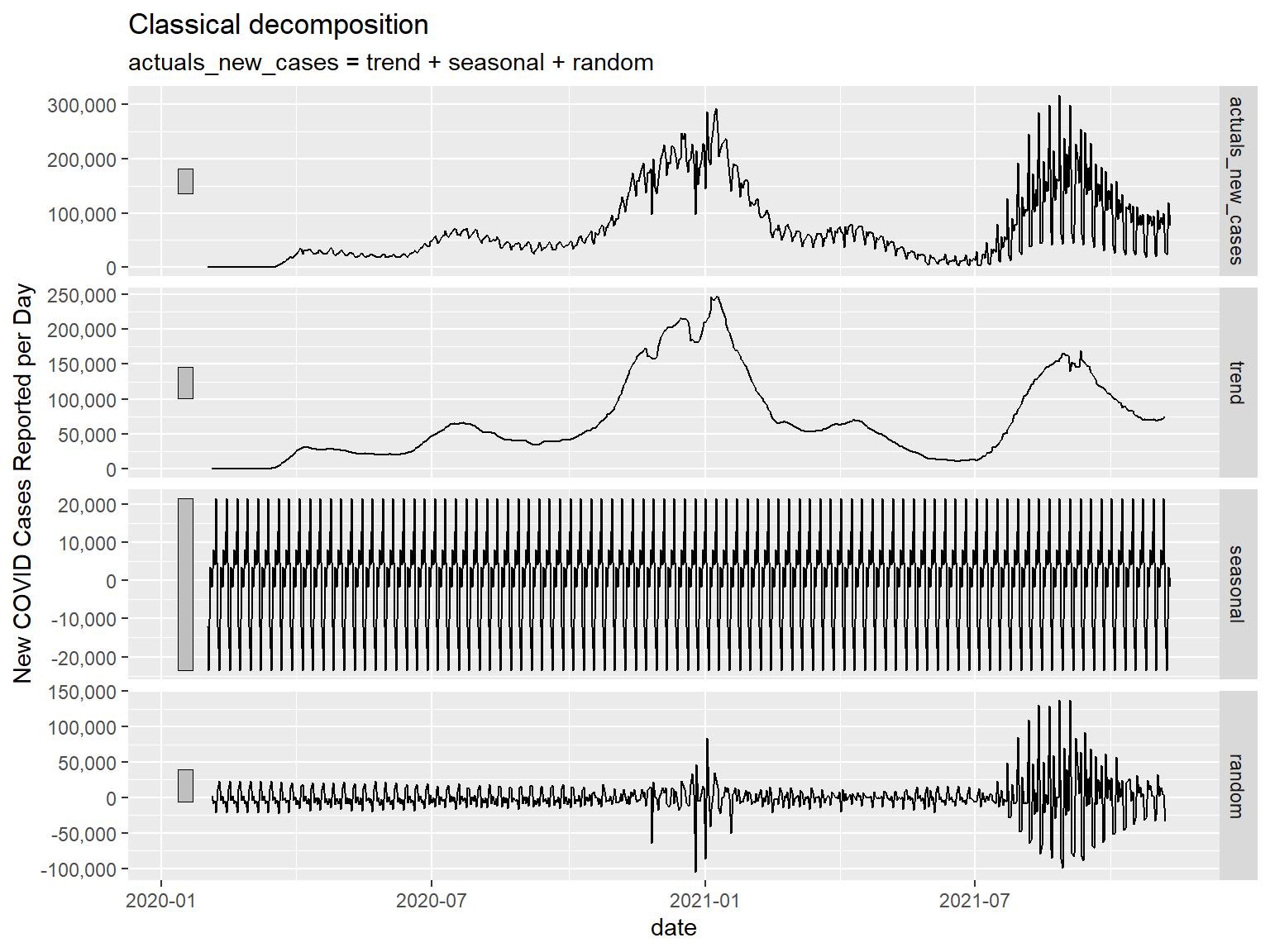
Classical Decomposition
Specifying the number of time units we are interested in decomposing for in the season() function within the decomposition model() we will be using (as below), we can arrive at a higher-tech solution (but the same result) to the simple seven day moving average we did before, with an identical plot. We can then generate a component() plot to show the different components of the decomposed time series data. You will see four panels in the component() plot:
Actuals – These are the actual source observations plotted for comparison to the other panels
Trend – This is the trend remaining after you have removed the seasonal (i.e. weekly in this case) effects
Seasonal – a plot of the seasonal (i.e. weekly) effects you removed.
Random - a plot of what the model assumes to be other random variation in observations not accounted for by the Trend or Seasonal effects. This should look like a relatively stable distribution (i.e. the White Noise model). Nevertheless, we see below that this does not look like a stable distribution – we see wide variation occurring in Winter 2020-2021 and in Summer 2021. I am guessing that these are effects from the holidays (you can see individual spikes around Thanksgiving, Christmas, and the New Year) and the Delta variant wave (Delta being substantially more contagious than previous waves of COVID). These are key to note, because it means if we were to be making conclusory statements with these data, we would need to be accounting for these effects somehow, since the remaining variances in the data are not randomly distributed.
us_ts %>%
  model(classical_decomposition(actuals_new_cases ~ season(7))) %>%
  components() %>%
  ggplot(., aes(x = date,y=trend))+
  geom_line()+
  scale_y_continuous(labels = comma)+
  scale_x_date(breaks = date_breaks("1 month"))+
  ft_theme()+
  labs(
    x = "Date",
    y = "New COVID Cases Reported per Day",
    title = "7-day Moving Average of New COVID Cases\nReported per Day in the United States",
    subtitle = paste0("(as of ",today(),")")
  )+
  theme(axis.text.x = element_text(angle = 60,hjust=1))
us_ts %>%
  model(classical_decomposition(actuals_new_cases ~ season(7))) %>%
  components() %>%
  autoplot() +
  scale_y_continuous(labels = comma, name = "New COVID Cases Reported per Day")
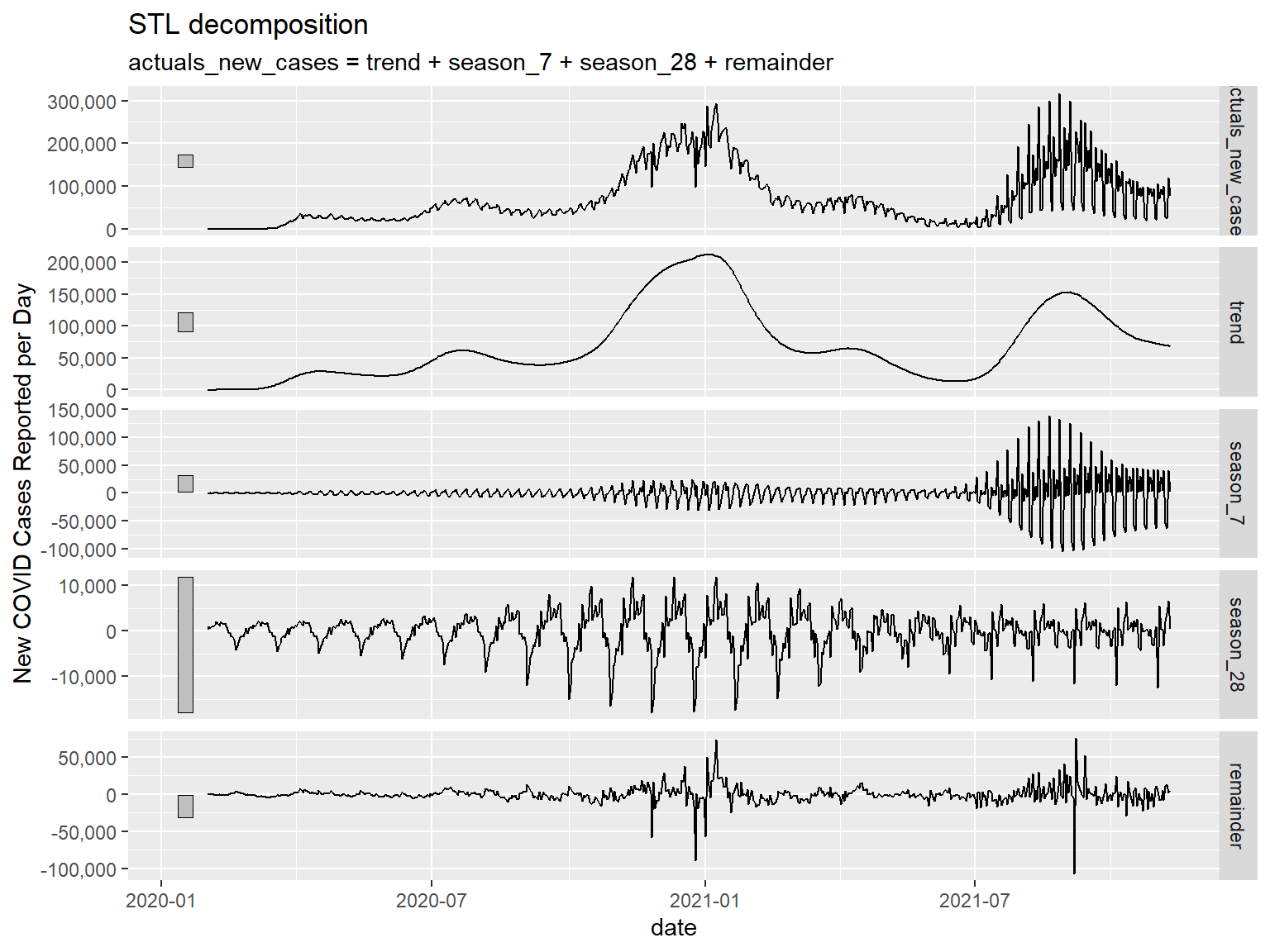
STL Decomposition
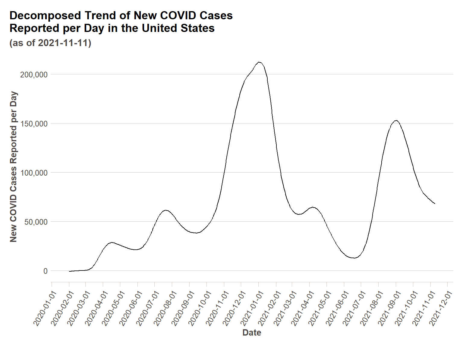
Below I will demonstrate the same plots using STL() decomposition. For demonstrative purposes, I am going to include another cyclical effect, an approximately monthly (28 days) cycle. Feel free to test out other cycles if you have a hypothesis. We will see one addition in our component plot below – the additional seasonal effect we have added.
us_ts %>%
  model(STL(actuals_new_cases ~ season(7) + season(28))) %>%
  components() %>%
  ggplot(., aes(x = date,y=trend))+
  geom_line()+
  scale_y_continuous(labels = comma)+
  scale_x_date(breaks = date_breaks("1 month"))+
  ft_theme()+
  labs(
    x = "Date",
    y = "New COVID Cases Reported per Day",
    title = "Decomposed Trend of New COVID Cases\nReported per Day in the United States",
    subtitle = paste0("(as of ",today(),")")
  )+
  theme(axis.text.x = element_text(angle = 60,hjust=1))
us_ts %>%
  model(STL(actuals_new_cases ~ season(7) + season(28))) %>%
  components() %>%
  autoplot() +
  scale_y_continuous(labels = comma, name = "New COVID Cases Reported per Day")
Further Analysis on Decomposed Data
Decomposition is typically necessary for time series data, and yet the purely temporal effects are usually not what we are interested in analyzing, they are simply to be controlled for. So I’d like to briefly demonstrate what one might do with decomposed data – I will compare the decomposed new cases per capita rate to the decomposed vaccination rate (once vaccination began) to see how strong the correlation is between the two for the U.S. as a whole. For this analysis I will only be decomposing for a seven day cycle, since that cycle is well understood – it is likely there are others that should be included for a more robust analysis.
After decomposing, I plot the data to take a look at it – what we see is there is clearly more to understanding new cases per capita (post-vaccine availability) than vaccination rate, as this looks remarkably similar to just the case rate over time. There are underlying epidemiological phenomena that would need to be included to get a stronger correlation, and to represent a relationship not so heavily influenced simply by the timeline of when vaccinations were given. Nevertheless, we can see in calculating the correlation coefficient and a simple linear model, that there is a statistically significant negative correlation (i.e. vaccination rate increasing relates to a decreased new cases per capita rate), and that vaccination does explain some variance in the new cases per capita rate.
decomp_us_ts = us_ts %>%
  mutate(new_cases_per_100k = actuals_new_cases/sum(county_pops$population/100000),
         first_shot_rate = actuals_vaccinations_initiated/sum(county_pops$population)) %>%
  mutate(ma_new_cases_per_100k = rollmean(new_cases_per_100k,7,fill = NA),
         ma_first_shot_rate = rollmean(first_shot_rate,7,fill=NA)) %>%
  filter(!is.na(ma_first_shot_rate),
         ma_first_shot_rate>0)

ggplot(decomp_us_ts,aes(x=ma_first_shot_rate,y=ma_new_cases_per_100k))+
  geom_point() +
  scale_x_continuous(labels = percent)+
  labs(
    x = "Percentage of U.S. Population (7-day average) that has Initiated Vaccination",
    y = "New Cases (7-day average) per 100k Population",
    title = "New Case Rate Relative to Vaccination Uptake",
    subtitle = "7-day Moving Averages"
  )+
  ftplottools::ft_theme()
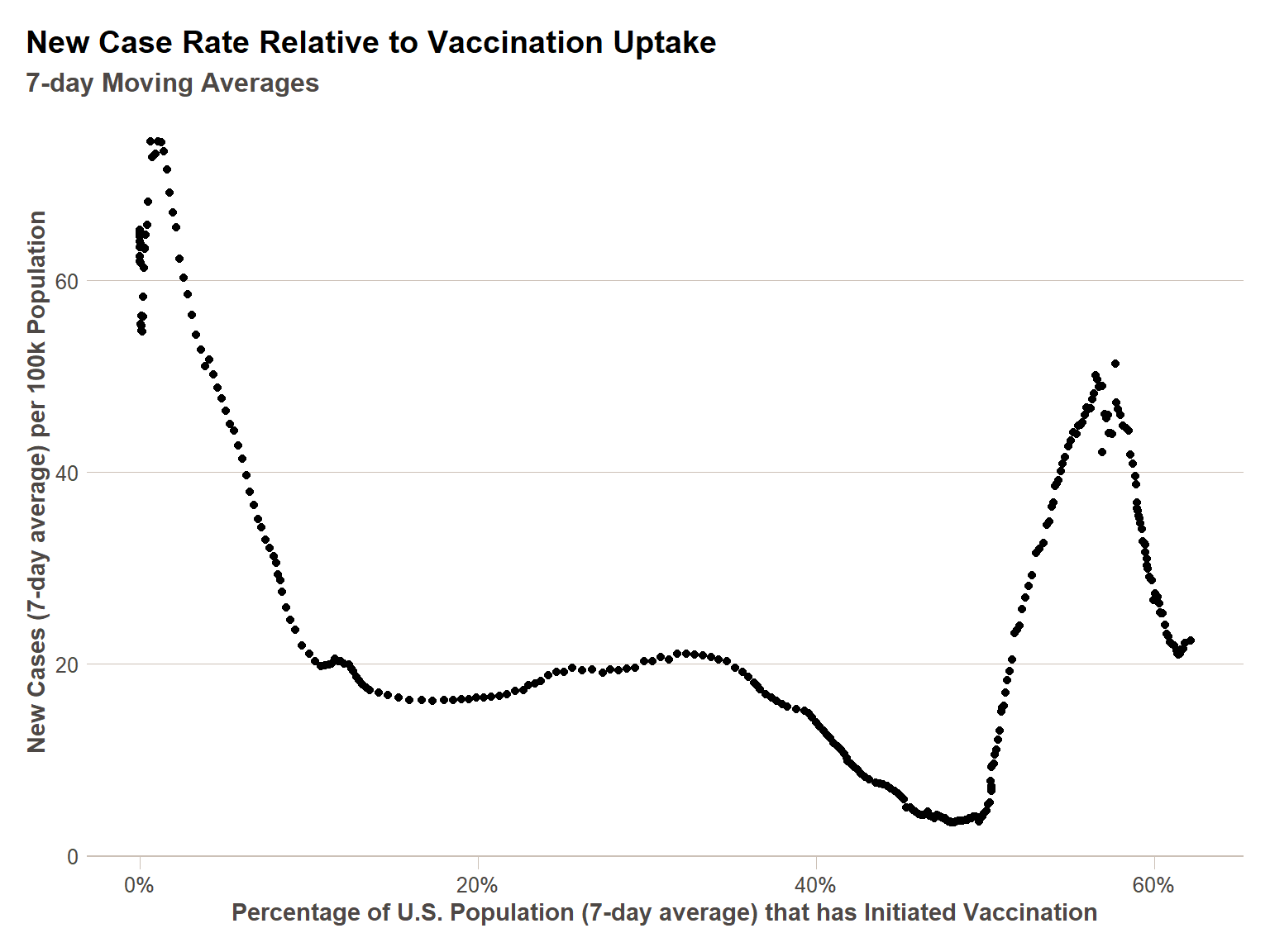
cor(decomp_us_ts$ma_first_shot_rate,
    decomp_us_ts$ma_new_cases_per_100k)
[1] -0.424344
Call:
lm(formula = ma_new_cases_per_100k ~ ma_first_shot_rate, data = decomp_us_ts)

Residuals:
    Min      1Q  Median      3Q     Max
-19.717 -16.332  -6.471  15.304  33.880

Coefficients:
                   Estimate Std. Error t value Pr(>|t|)
(Intercept)          40.940      1.838   22.27  < 2e-16 ***
ma_first_shot_rate  -37.078      4.362   -8.50  6.7e-16 ***
---
Signif. codes:  0 '***' 0.001 '**' 0.01 '*' 0.05 '.' 0.1 ' ' 1

Residual standard error: 16.97 on 329 degrees of freedom
Multiple R-squared:  0.1801,    Adjusted R-squared:  0.1776
F-statistic: 72.25 on 1 and 329 DF,  p-value: 6.699e-16
To dive deeper into this data, we would need a) some statistical modeling techniques addressed in the linked courses below and b) a deeper scientific background in the underlying epidemiological phenomena of COVID spread – so this is a good place to wrap up.
Reference Materials
This was a high level look at time series analysis – if you have further interest, I recommend you consider the resources below, and if there is sufficient interest, I can design more training modules around time series analysis on particular transportation topics.
Further Reading
Related DataCamp Courses
- Time Series Analysis with R (1 course, 4 hours)
- Time Series Analysis with R Skill Track (6 courses, 25 hours)
This content was presented to Nelson\Nygaard Staff at a Lunch and Learn webinar on Thursday, October 28, 2021, and is available as a recording here and embedded at the top of the page.